
If Part 1 of the 2027 Colors of the Year was about putting down roots, Part 2 is where things get a little more interesting.
Because while the big 2027 story is still very much about comfort, nature and creating homes that feel restorative, we’re also seeing another theme emerge: we want color that gives us room to be ourselves.
And apparently, blue has received the memo.
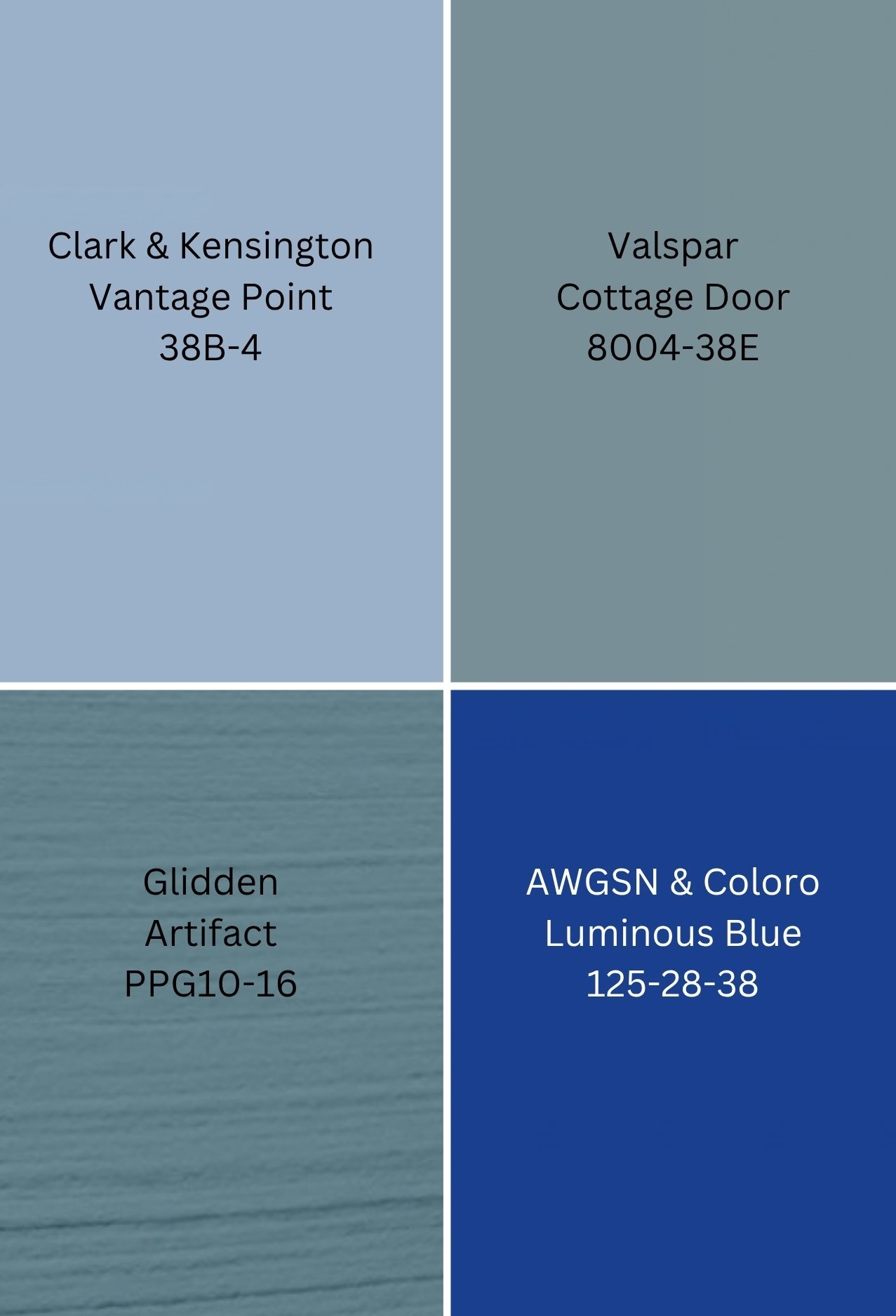
Several of the 2027 selections are blue or blue-adjacent, but they are not all the same blue. We’ve got a soft, welcoming blue-gray, a smoky aqua, a richer sophisticated blue and then there is Luminous Blue, which essentially kicks the door open and says, “Enough with all this behaving.”
You know which one I’m talking about.
Let’s get into it.
Valspar
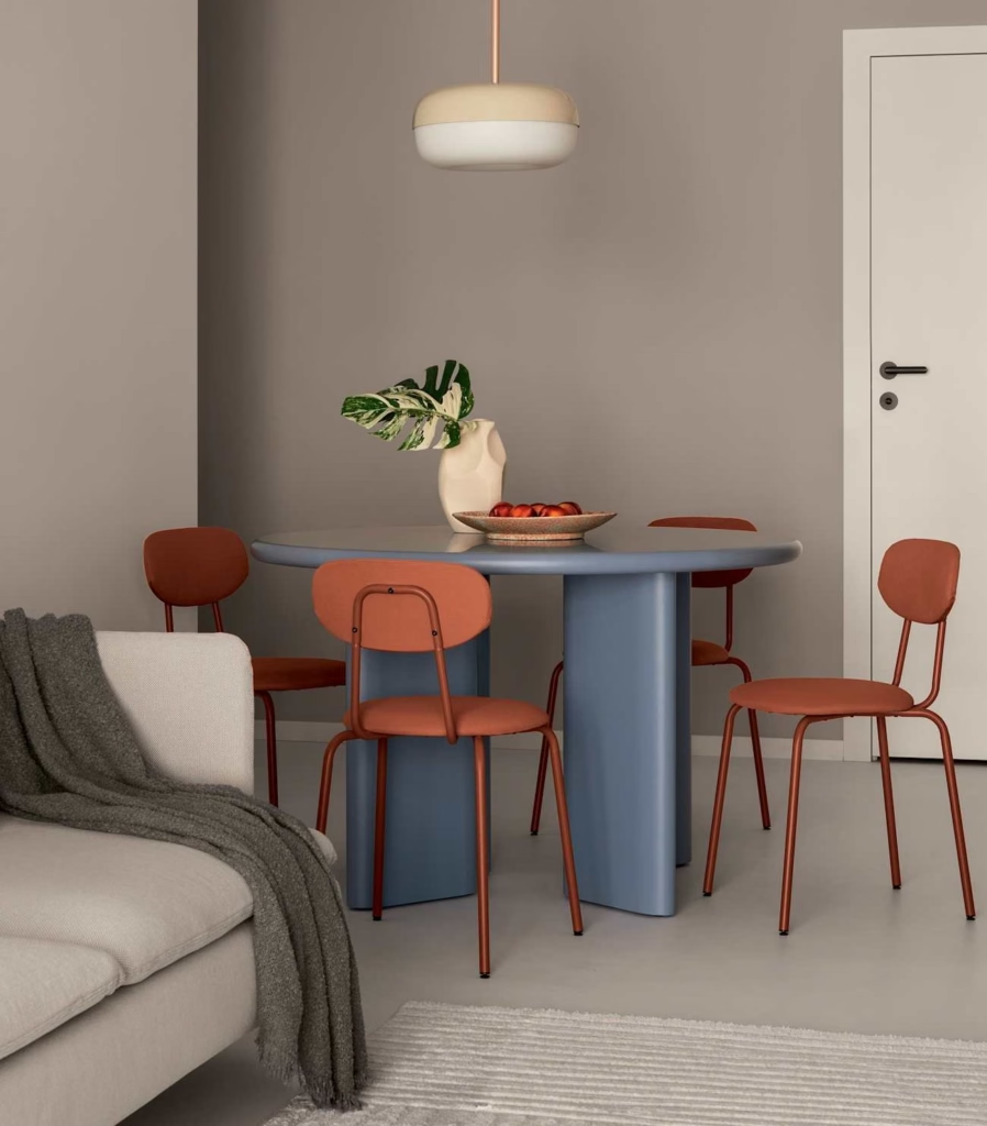
Greyed out blue | Cottage Door
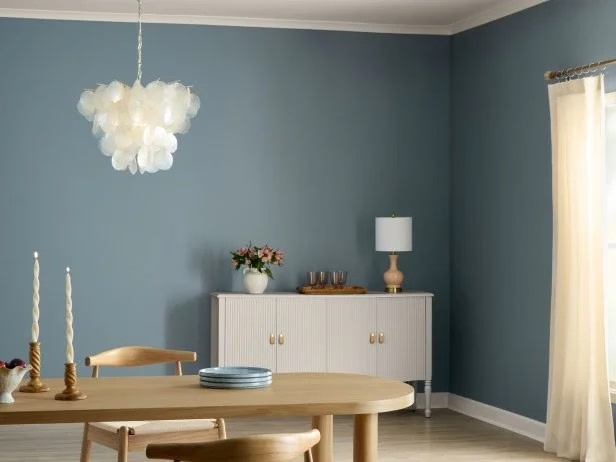
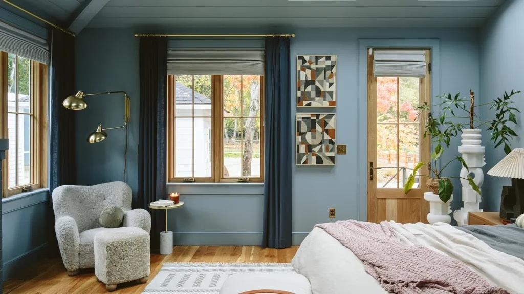
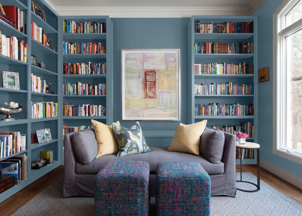
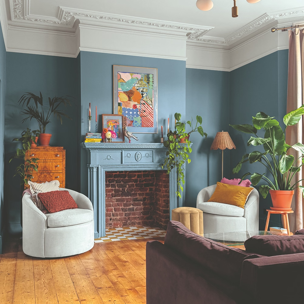
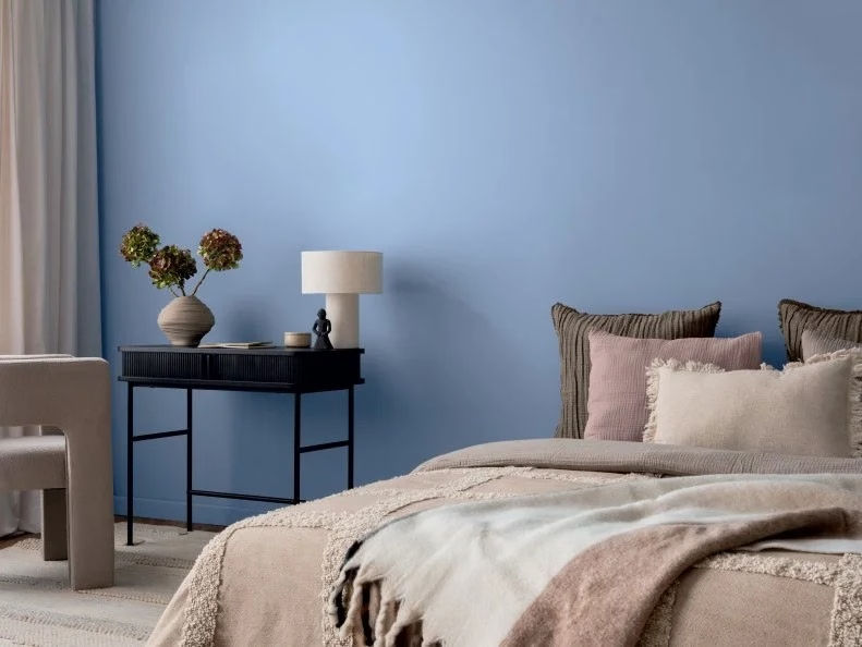
Valspar’s Cottage Door 8004-38E is a grayed-out, mid-tone blue with warm and inviting undertones. Valspar describes it as a modern neutral designed to create moments of respite and reflection.
And I think the word “neutral” is important here.
We are clearly moving into a period where neutral doesn’t automatically mean beige, cream or gray. A soft blue can function as a neutral because it provides a calming foundation while still giving the room some personality.
Valspar says its choice was influenced by a desire for less stress, less information, less technology and fewer choices—a longing for simplicity and peaceful spaces. The company also points to a growing desire for homes that feel honest, grounding and authentically lived-in rather than perfectly curated.
Well, that feels pretty 2027 to me.
Cottage Door has the kind of versatility that makes it easy to imagine on walls, cabinetry, exterior details or even furniture. And because it sits somewhere between blue and gray, it can work beautifully with warm wood, natural textures and creamy neutrals.
But don’t mistake “calming” for “bland.”
A room painted Cottage Door with an incredible piece of art, a vintage chair, sculptural lighting and a few unexpected accessories could be spectacular.
This is a color for the person who wants their home to say “I’m relaxed” rather than “I spent six hours making this room look relaxed.”
Glidden
Artifact | Calm fresh aqua
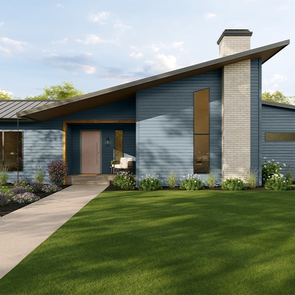
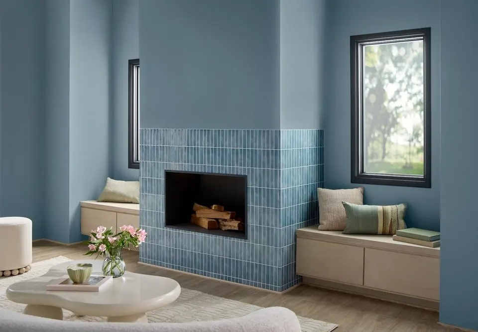
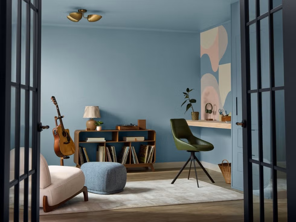
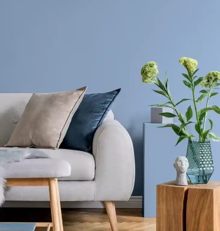
Glidden’s Artifact PPG10-16 is described as a calm, smoky blue—and Glidden is positioning it as something of a reset button for your home. No demolition required. No contractor required. No months of living with a refrigerator in the garage.
Just paint.
Glidden’s reasoning is particularly interesting because the brand is talking about flexibility and personal expression. Artifact is designed to work as a backdrop for a wide range of design styles, from minimalist to maximalist, without dictating what the rest of the room has to be.
And honestly? Yes.
One of the best things happening in design right now is the death of the idea that every room has to subscribe to one particular aesthetic.
You can have a modern sofa with an antique table. A traditional painting over a contemporary console. A vintage lamp next to a sculptural chair. A colorful rug in an otherwise restrained room.
Artifact fits right into that philosophy because it is interesting enough to have a point of view but restrained enough to let everything else have one too.
Glidden calls it a fresh realignment—a way to refresh a room without turning the whole house upside down.
And I particularly like that idea for people who want change but aren’t interested in a full-scale renovation.
Sometimes your house doesn’t need a remodel.
Sometimes it needs a gallon of paint and a little nerve.
Ace Hardware | Vantage Point
Now we go deeper.
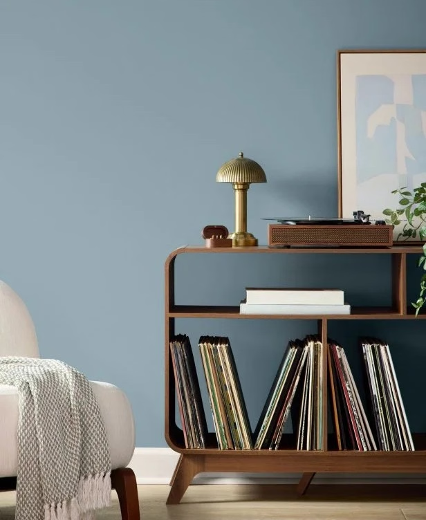
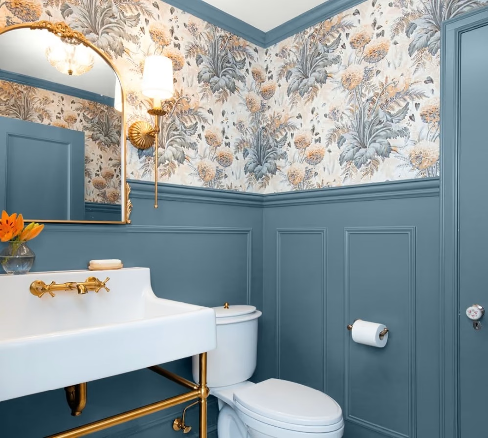
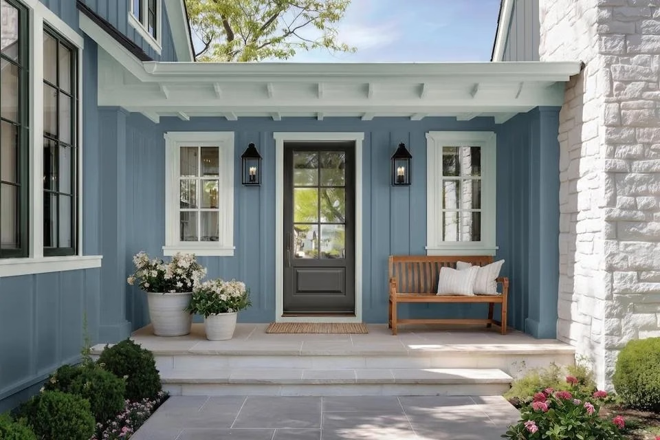
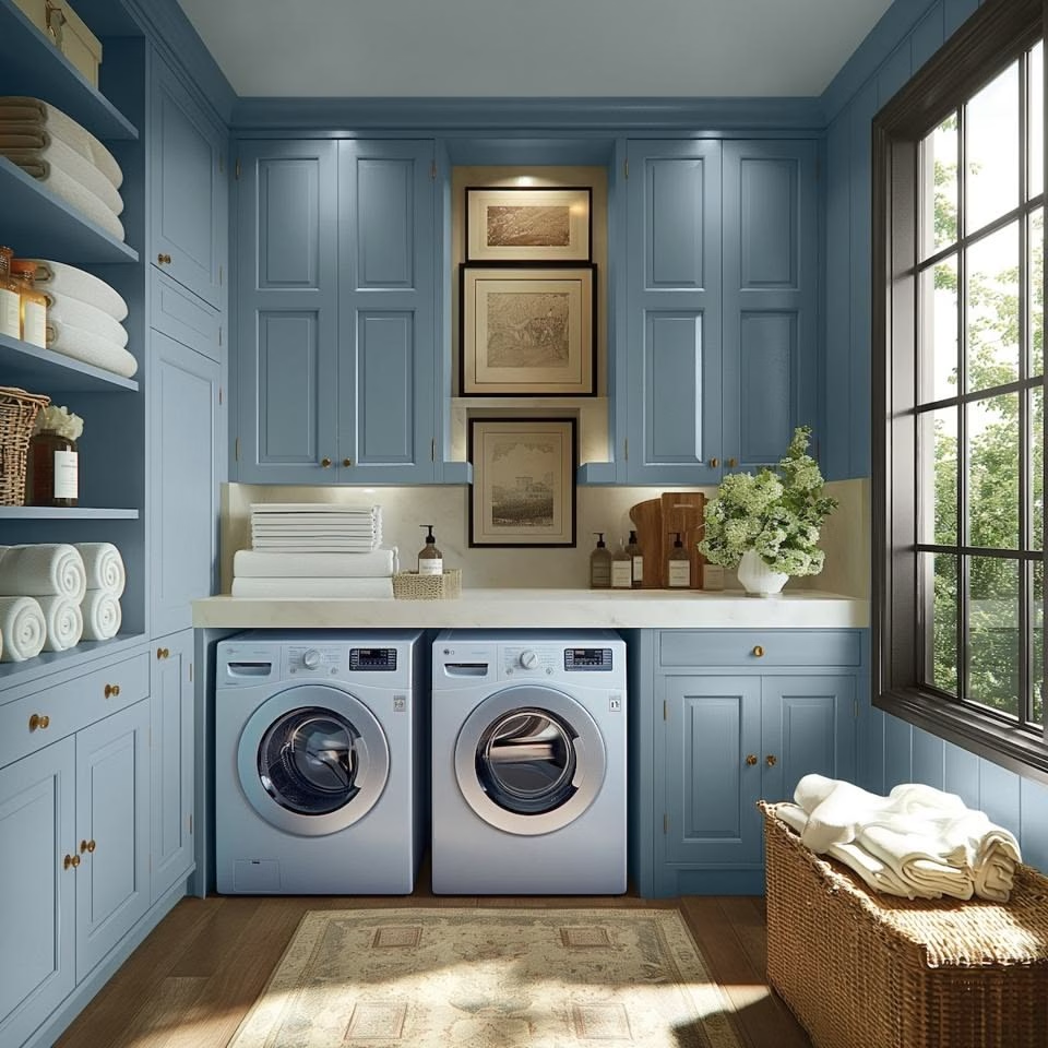
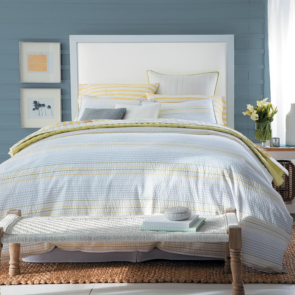
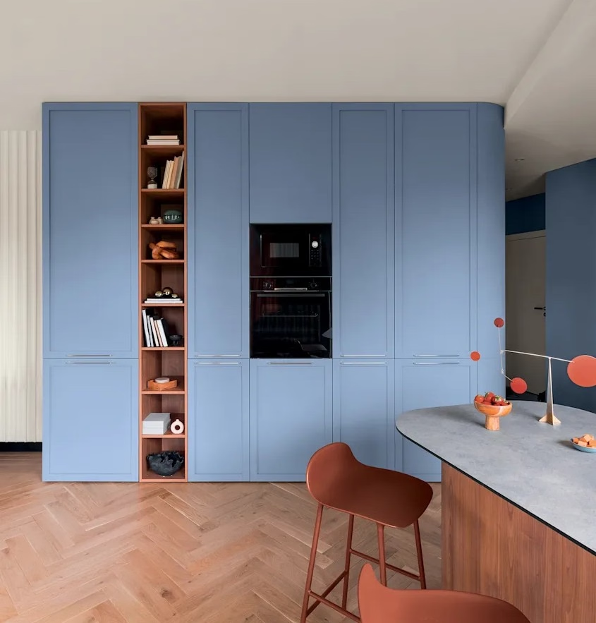
Clark+Kensington’s Vantage Point 38B-4 is a rich, sophisticated blue selected in collaboration with trend forecasting firm Colour Hive. The brand says homeowners are looking for more moments of connection at home, and Vantage Point was chosen because it brings warmth and character while still feeling fresh for 2027 and timeless enough to live with.
This is the blue for somebody who wants a little more drama.
Vantage Point has enough depth to create a focal point without becoming one of those colors that immediately announces, “I will be difficult to decorate around.”
And that versatility is important because the 2027 conversation isn’t simply about retreating into quiet, neutral spaces. It’s also about making homes feel personal and emotionally engaging.
Clark+Kensington’s accompanying palettes—Drift and Mellow—reflect that same duality. Drift brings in lighter, more optimistic colors, while Mellow leans into warm neutrals and earthy tones.
In other words, you can take Vantage Point in different directions.
Want a cozy bedroom? Absolutely.
A sophisticated home office? Please.
A dramatic dining room? Now you’re speaking my language.
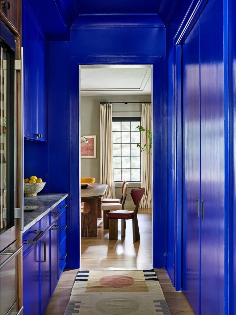
And if you’re a color-drenching enthusiast, I can already see the walls, trim and ceiling getting the Vantage Point treatment.
Because sometimes a room doesn’t need to be calm.
Sometimes it needs a little attitude.
And finally…
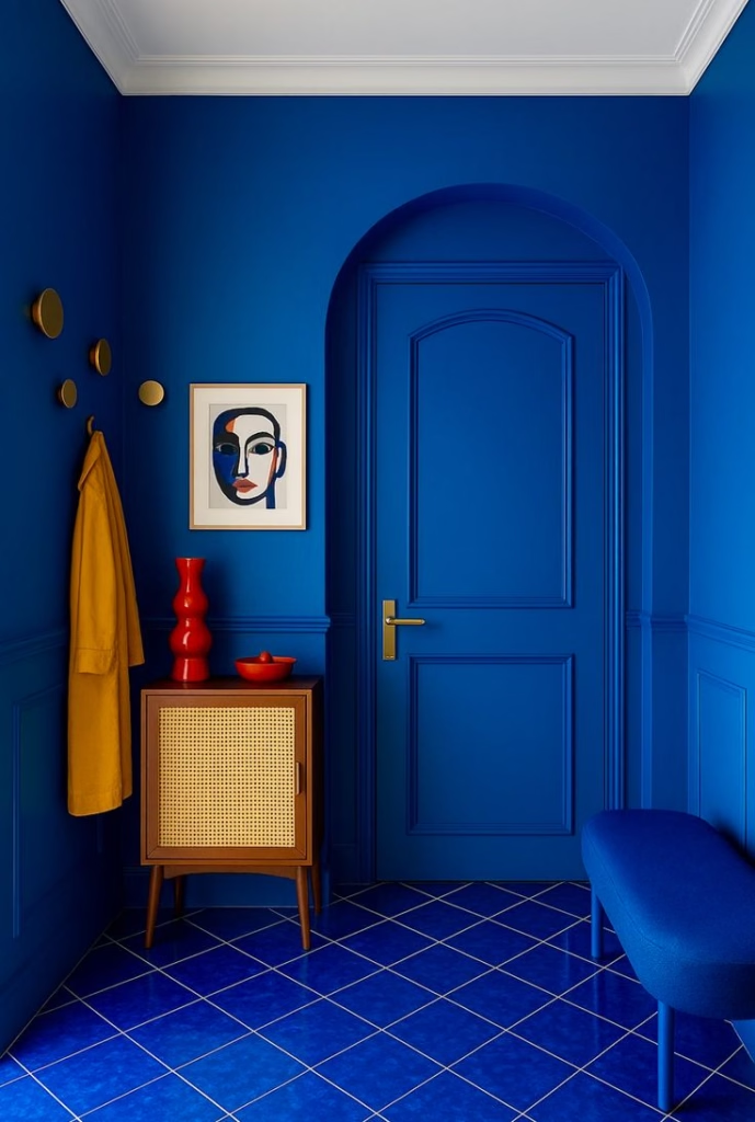
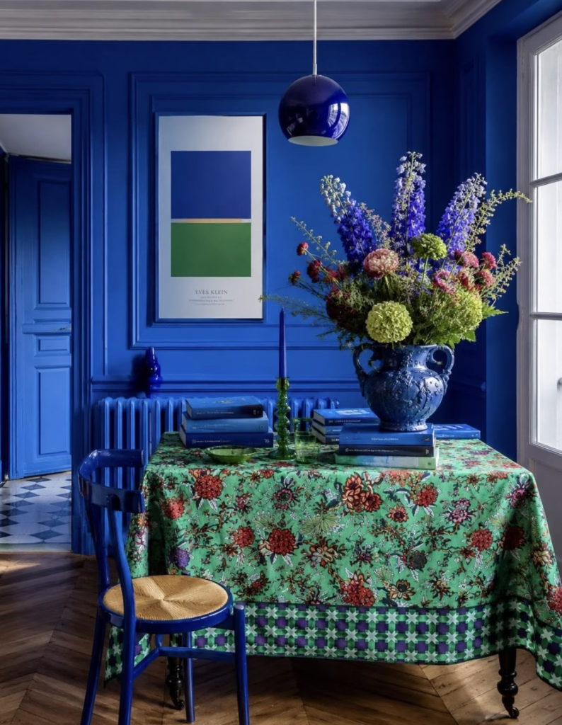
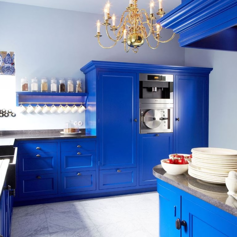
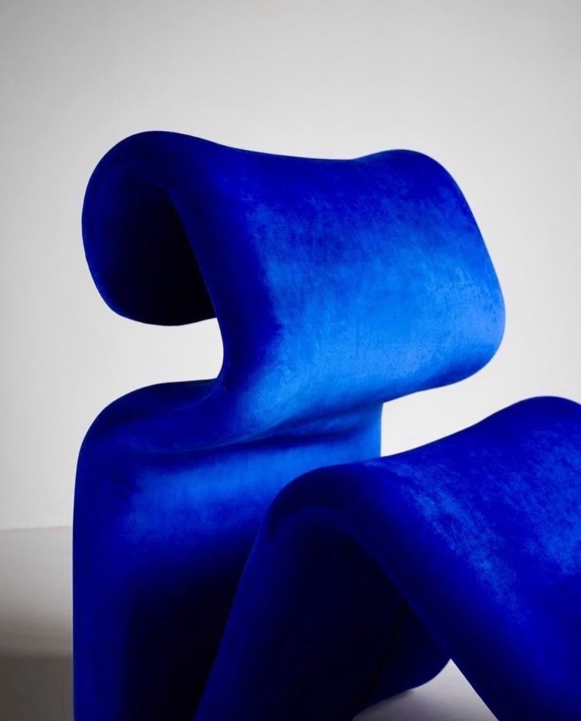
Luminous Blue.
Oh, we’re definitely not whispering anymore.
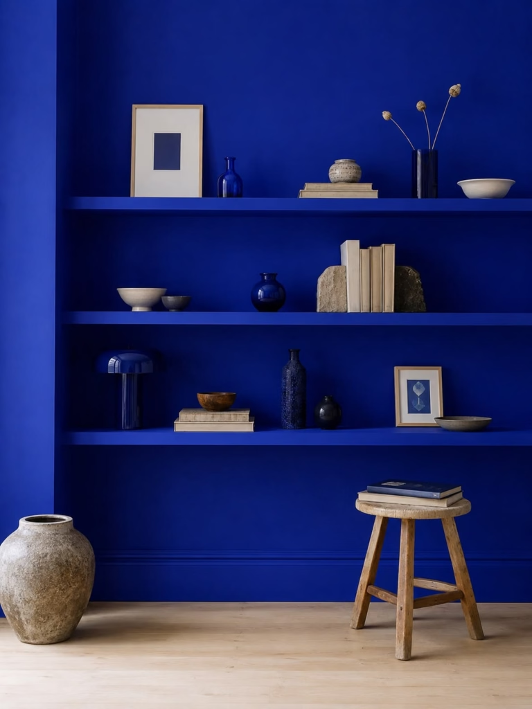
WGSN and Coloro selected Luminous Blue, Coloro 125-28-38, as their 2027 Colour of the Year back in 2025 as part of their longer-range trend forecasting. Their research identified interconnectedness as a defining theme for 2027, particularly the intersections between nature and technology, ancient and contemporary, online and offline, rationality and spirituality.
And suddenly this electric, mysterious blue makes perfect sense.
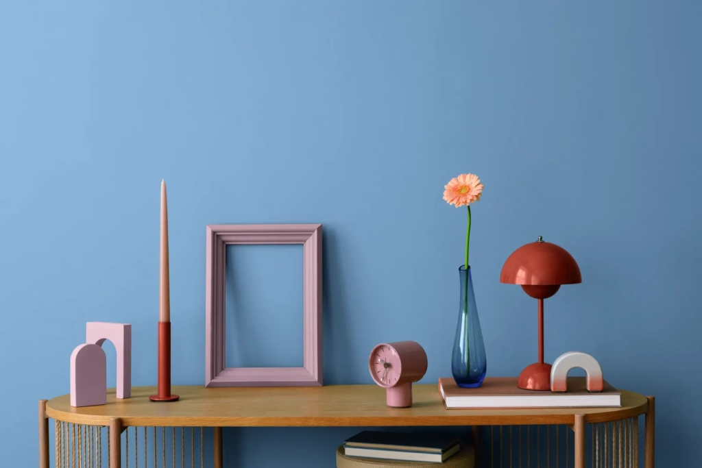
Unlike some of the softer blues we’ve already discussed, Luminous Blue is dynamic, eccentric and expressive. WGSN describes it as versatile enough to move across categories ranging from occasionwear to activewear.
This is color as emotional release.
WGSN’s broader forecast points to a world experiencing enormous pressure and uncertainty—a “polycrisis”—and suggests that playful, joyful color can become a kind of coping mechanism. Their 2027 palette deliberately balances earthy, grounding hues with energetic colors that encourage joy and play.
And I think this is where Luminous Blue is particularly fascinating.
We don’t always need our homes to soothe us.
Sometimes we need them to wake us up.
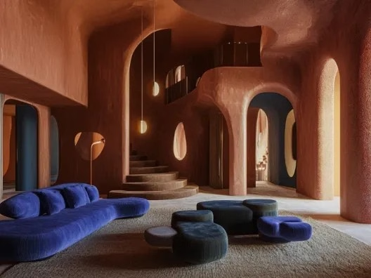
Luminous Blue could be incredible in lacquered cabinetry, a powder room, a piece of furniture, an accent wall, upholstery or artwork. And because it has such a strong personality, I wouldn’t necessarily try to tame it.
Let it be weird.
Let it be fabulous.
Let it be the thing everyone remembers when they leave your house.
https://www.ocres-de-france.com/en/cms/32/8-colors-to-embrace-in-2022
https://www.decorpad.com/designers/Zoe-Feldman-Design
The Big 2027 Color Story
When you put these four colors together—Cottage Door, Artifact, Vantage Point and Luminous Blue—you can see why blue is having such a moment.
But it isn’t one blue story.
Cottage Door is about comfort and familiarity.
Artifact is about resetting and personal freedom.
Vantage Point is about connection and character.
Luminous Blue is about energy, imagination and joy.
And that is really the bigger story behind the 2027 Colors of the Year.
We’re no longer designing our homes simply to impress other people.
We’re designing them to support the lives we’re actually living.
Sometimes that means a soft green bedroom where you can shut the door and disappear for a while. Sometimes it’s an earthy orange dining room where everyone gathers around the table. Sometimes it’s a smoky blue office where you can actually concentrate. And sometimes it’s an absolutely ridiculous electric-blue chair that makes you smile every time you walk past it.
All of those things can coexist.
And perhaps that’s the most interesting thing about the 2027 color forecast: there doesn’t seem to be one “right” way to use color.
There is room for the introvert.
There is room for the maximalist.
There is room for the color-phobic. And there is DEFINITELY room for those of us who see a fabulous color and immediately start wondering what else we can paint.
So if the 2027 color forecast is any indication, the future of interiors isn’t about choosing between calm and creativity.
It’s about having both.
And frankly, I’m ready to paint something.
And we’re not even done yet. Benjamin Moore and Pantone are still to come. I can’t wait to see what they have in store.
See ya next time.

0 Comments