
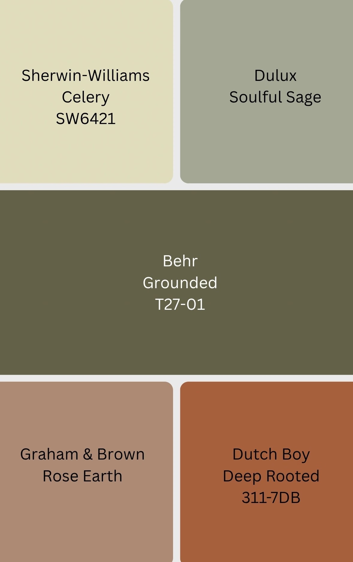
If there is one thing the 2027 Colors of the Year are telling us, it’s this: apparently, we would all like to calm the hell down. And honestly? That’s fair.
After years of design trends swinging between beige minimalism, dopamine decorating, moody interiors, maximalism and every shade of green known to mankind, the paint companies seem to have collectively decided that our homes need to do something more important than simply look pretty. They need to make us feel good.
The 2027 selections are heavily influenced by nature, wellness, restoration, comfort, authenticity and our desire to create homes that actually feel like us. And while there are plenty of beautiful neutrals in the world, these colors prove that calming does not have to mean boring. Green can be soft and sophisticated. Orange can be grounding. Pink can become a new neutral. And a color inspired by celery can somehow become downright elegant.
I am not mad about any of this.
Here are five of the 2027 Colors of the Year that are already giving me plenty to think about.
Sherwin-Williams
Let’s start with the color that probably made a few people say, “Celery? Really?” Yes. Really.
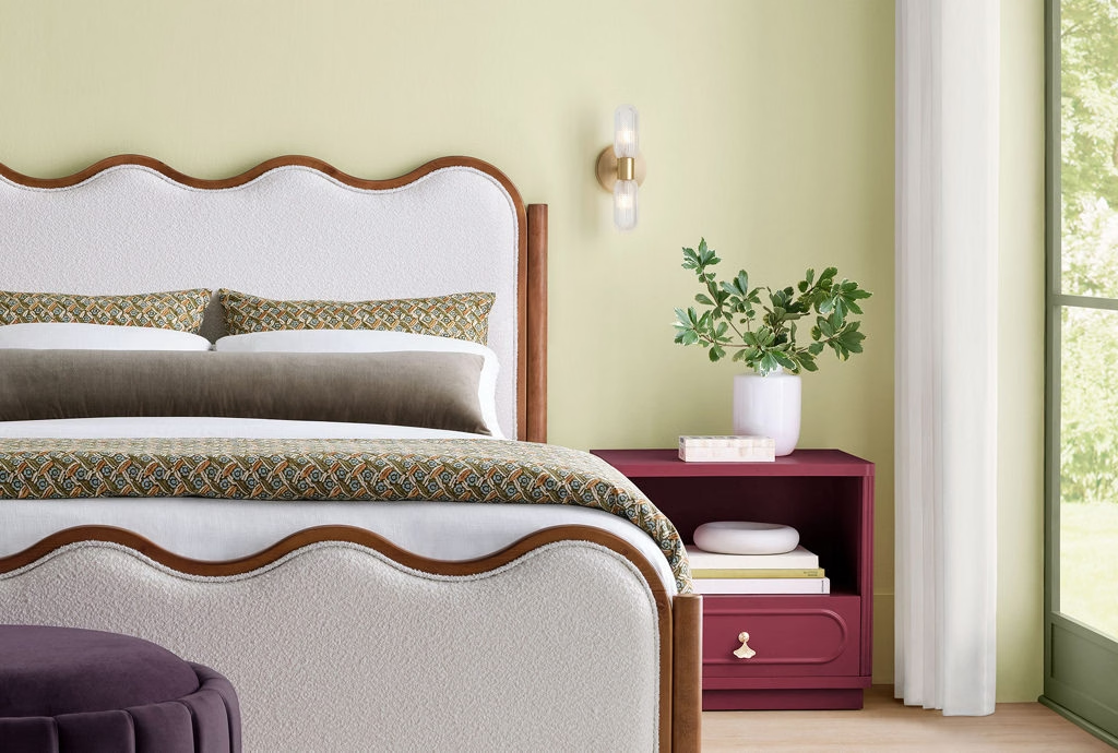
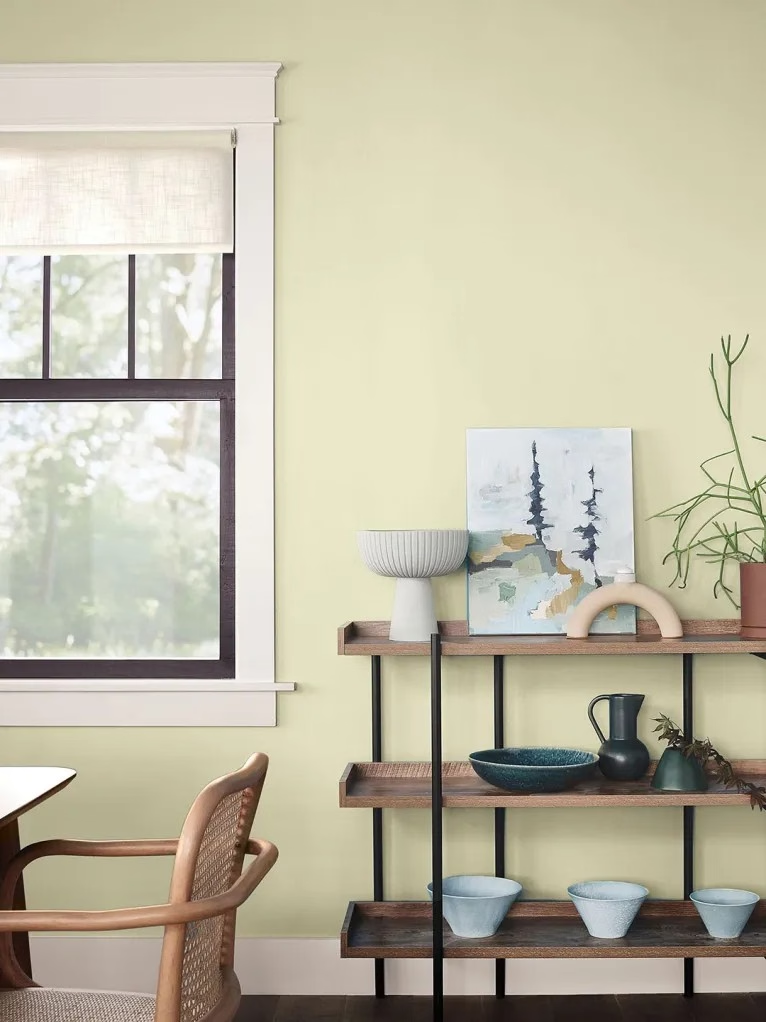
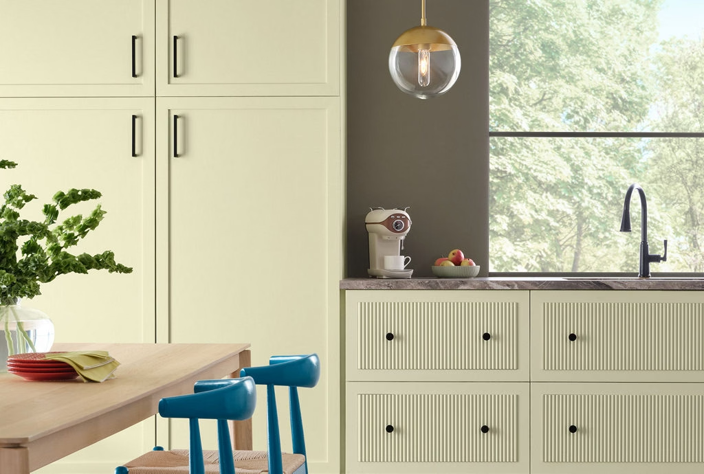
Sherwin-Williams chose Celery, an airy, muted herbal green with subtle yellow undertones, as its 2027 Color of the Year. The brand describes the shade as a balance between an airy pastel and a grounded herbal green, with its larger “Rewild” forecast emphasizing nature, wellness, balance and connection. Sherwin-Williams says the color was chosen to reflect three themes that emerged in its research: wellness, storytelling and belonging.
And this is where Celery makes a lot more sense than its name initially suggests. We are living in a world where our homes have increasingly become offices, restaurants, entertainment centers, gyms, retreat spaces and, occasionally, the place where we hide from everyone while pretending we’re not home. We want those spaces to feel restorative.
Celery brings the outdoors inside without going full forest floor. Its yellow undertone gives it a little optimism, while the green keeps it connected to nature. It can be calming without becoming sleepy and colorful without taking over the room.
I can see this being particularly fabulous in a kitchen, bathroom, bedroom or reading nook. And naturally, I’m imagining it with warm wood, natural stone, creamy textiles and art. Basically, it has Modern Organic written all over it.
The bigger message from Sherwin-Williams is that color is becoming less about following a trend and more about creating a feeling. Celery isn’t trying to be the loudest color in the room. It is trying to make you want to stay in the room.
Dulux
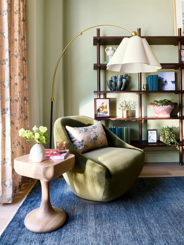
Well, apparently Sherwin-Williams and Dulux were having the same conversation because green is also having a major moment at Dulux.
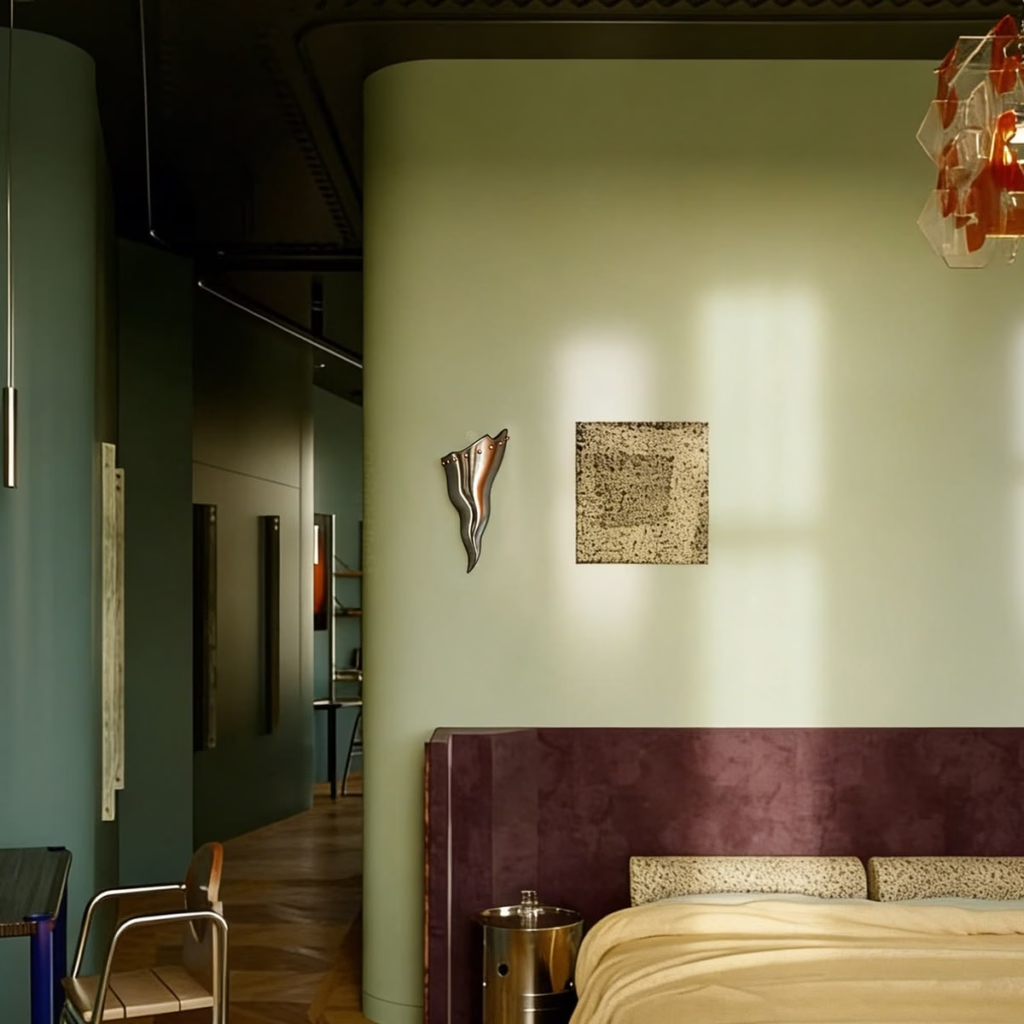
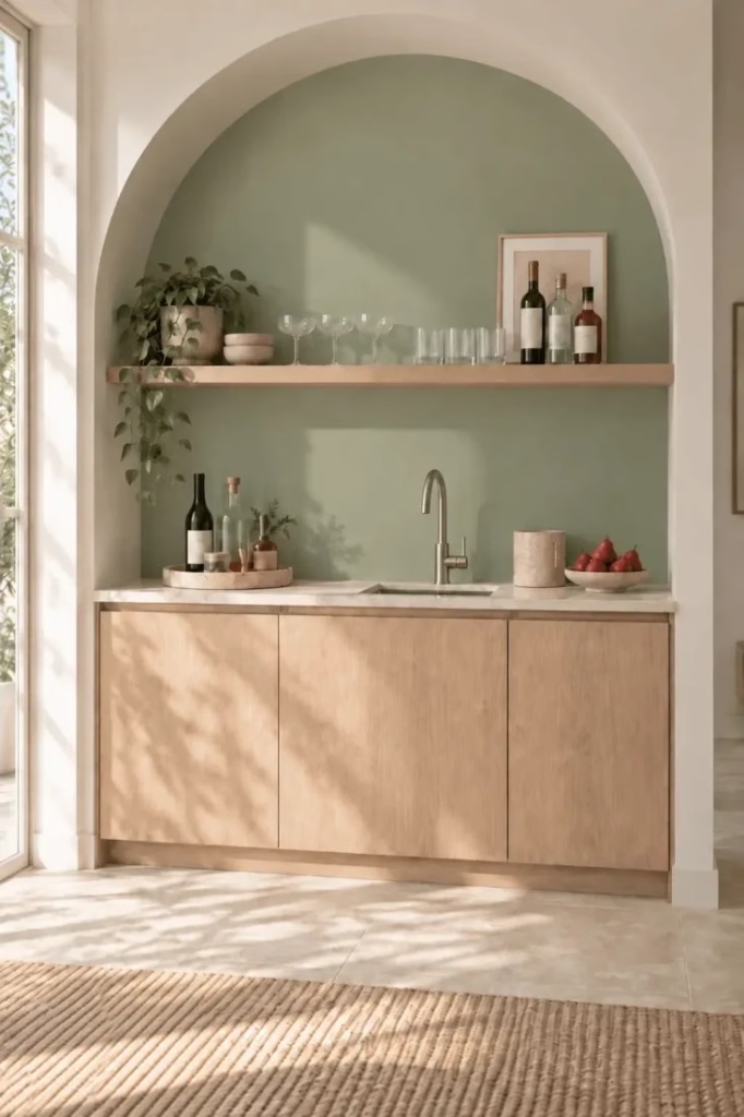
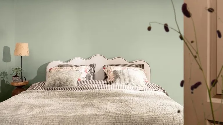
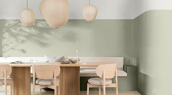
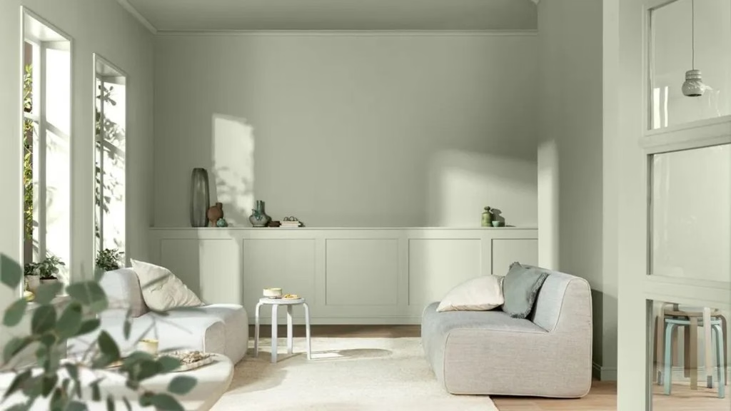
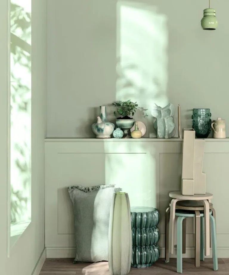
Dulux selected Soulful Sage as its 2027 Colour of the Year—a light, soft, silvery green inspired by nature. The brand’s theme for the year is “Live Lightly,” a response to what its trend forecasters describe as the emotional weight of modern life, world events and information overload. In other words, we need a break and Soulful Sage is basically a visual exhale.
Dulux sees green as particularly appropriate right now because of its connection to nature and its associations with balance and wellbeing. The company also emphasizes the color’s versatility, creating three accompanying palettes called Glow, Light and Lift, allowing Soulful Sage to move from peaceful and understated to warmer, more energetic and playful combinations.
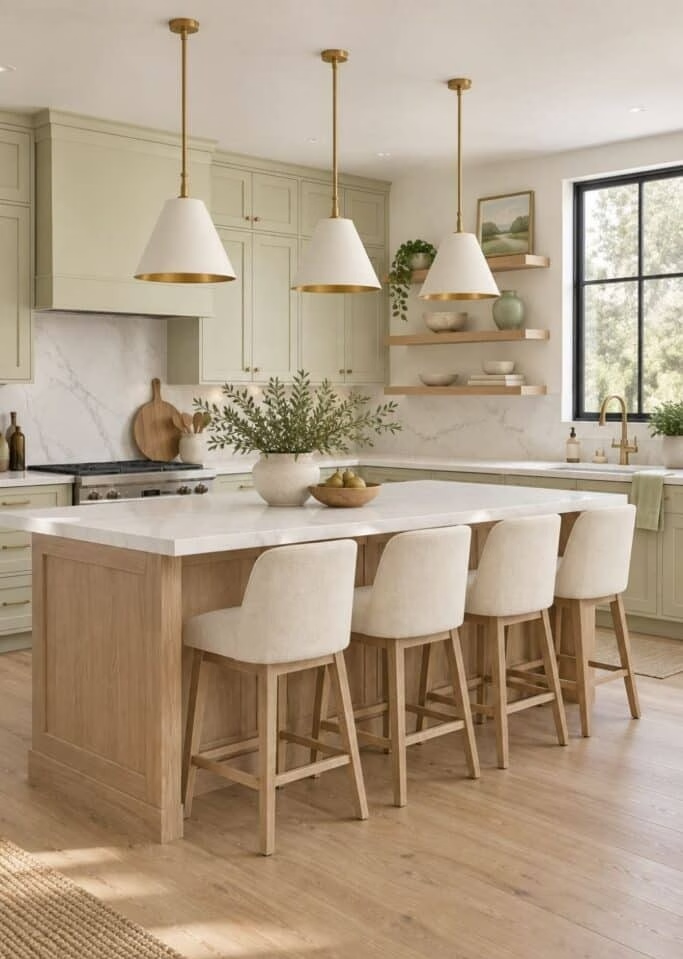
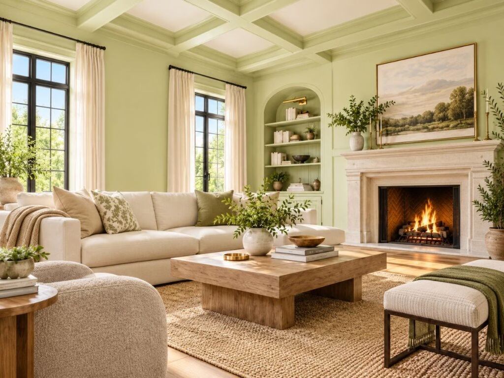
What I love here is that Dulux isn’t suggesting that calming color has to equal a boring room. Soulful Sage can absolutely be used in a full color-drenched space, including walls, ceiling and woodwork. It can also be combined with ochres, pinks, clay tones and other greens for something much more layered.
This is exactly where I think 2027’s color story gets interesting. We’re moving away from the idea that a serene home must be white, beige or gray. Color itself can be calming.
And if you’re wondering where I would use Soulful Sage? A bedroom would be gorgeous. A kitchen could be stunning. A home office would make perfect sense. And a color-drenched living room with natural wood and vintage pieces? Oh, now we’re talking.
Behr
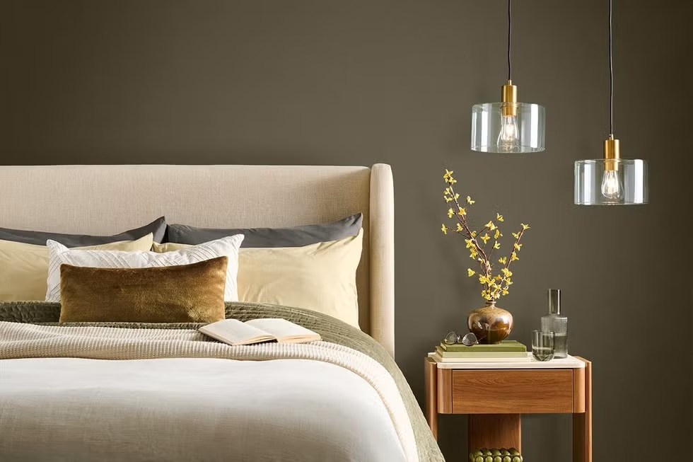
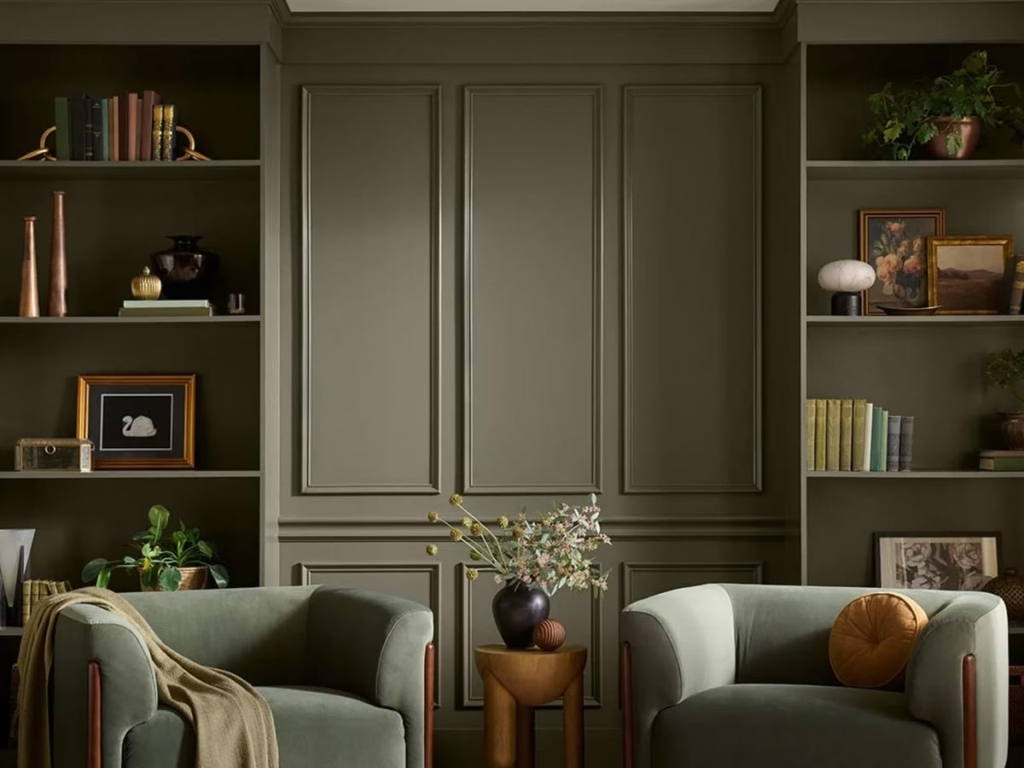
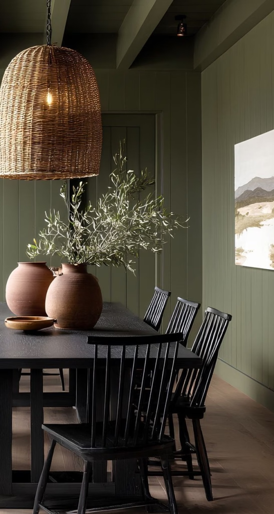
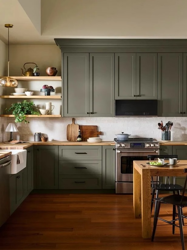
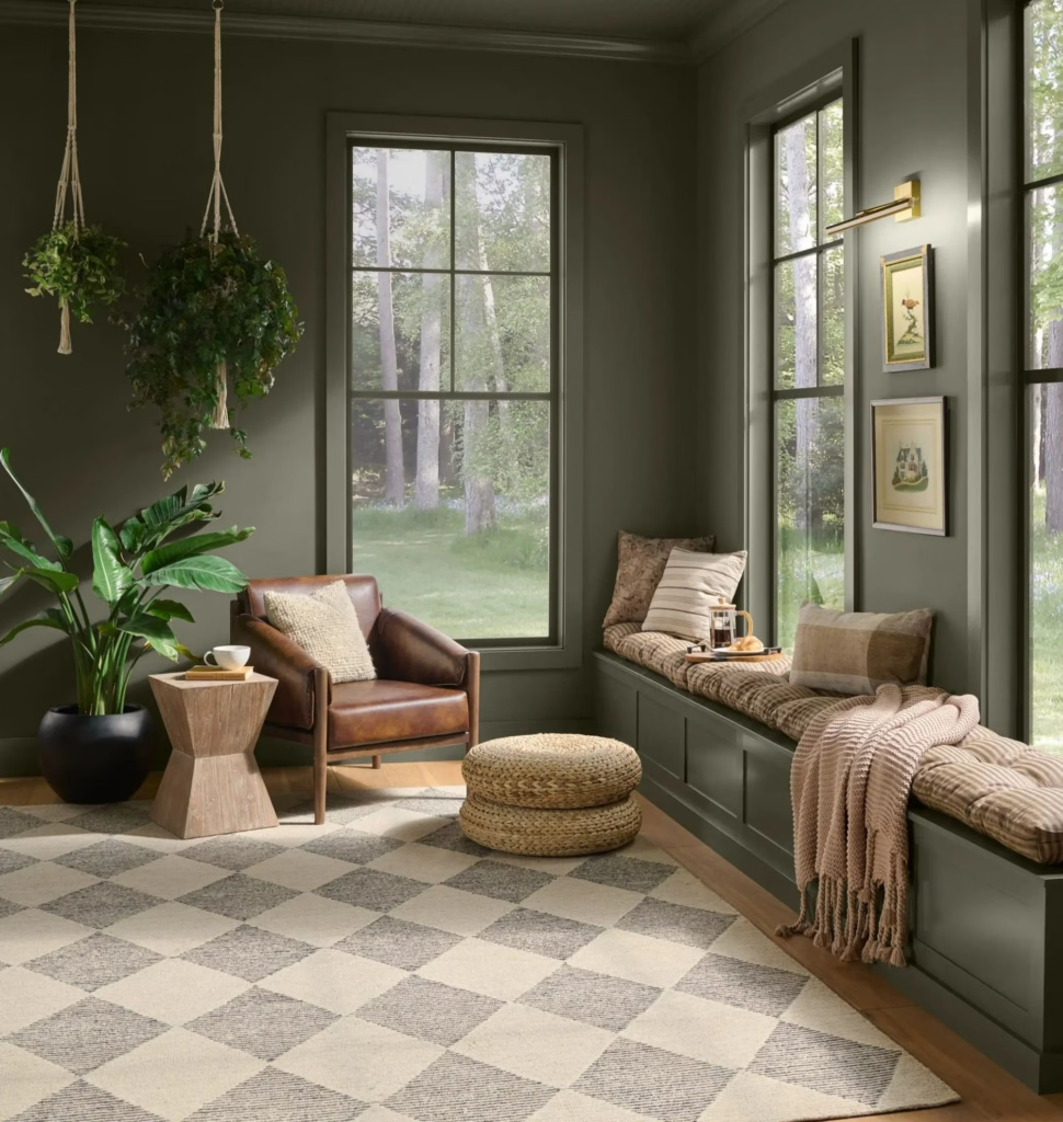
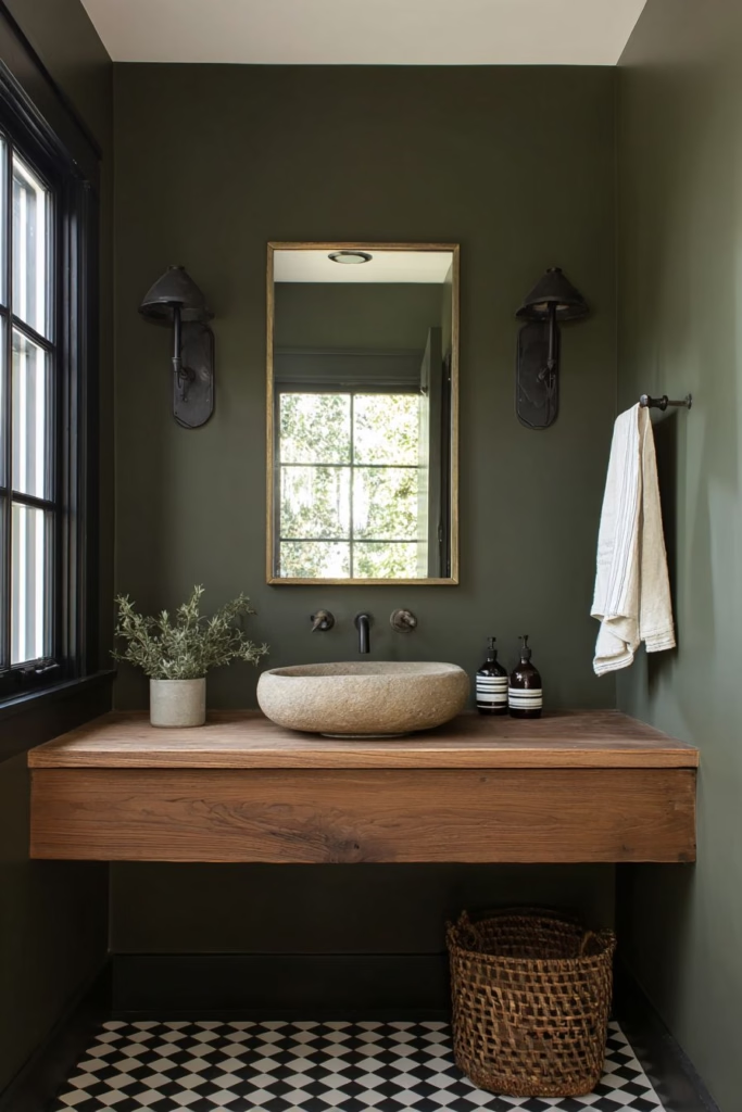
If the name Grounded doesn’t tell you exactly what Behr was going for, the color certainly does. Behr’s 2027 Color of the Year is Grounded, a mossy olive green with earthy brown undertones. Behr describes it as a “living neutral”—a color with enough presence to make a statement but enough versatility to work much like a traditional neutral.
And the reasoning behind it is particularly revealing. Behr says people increasingly want homes that feel rooted, lived-in and real. Its research found that 77% of surveyed Americans turn to nature when life feels chaotic, while 86% said DIY and design projects can help them feel grounded by creating a comforting haven at home.There is that word again: grounded. Clearly, 2027 has something to say.
Grounded is also a little more sophisticated and grown-up than the bright greens we’ve seen in previous trend cycles. It sits somewhere between moss and olive, making it wonderfully compatible with wood, stone, leather, concrete and metal. Behr specifically highlights its ability to work across both interiors and exteriors.
This is a color I could see being absolutely gorgeous on kitchen cabinetry. Imagine Grounded cabinets with creamy countertops, unlacquered brass, vintage art and warm wood. Or a moody study with the walls, trim and shelving all done in Grounded.
And here’s the thing: I love a color that can play neutral without actually being neutral. That is a very 2027 concept.
Graham & Brown
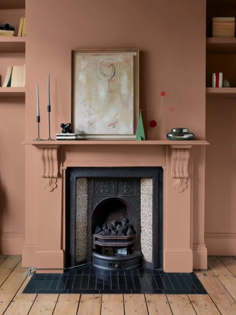
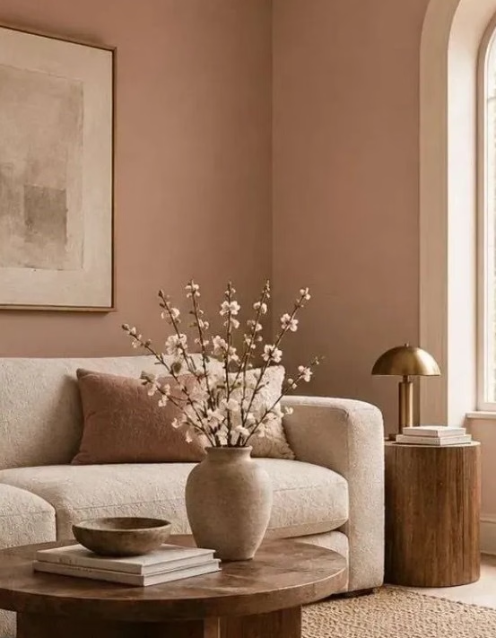
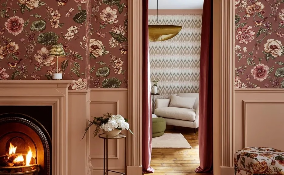
Graham & Brown selected Rose Earth as its 2027 Color of the Year, and I think the name tells you almost everything you need to know. This is not bubblegum pink. It isn’t Barbie pink. It isn’t screaming “look at my pink room!”
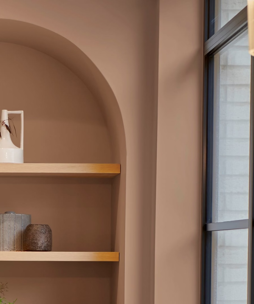
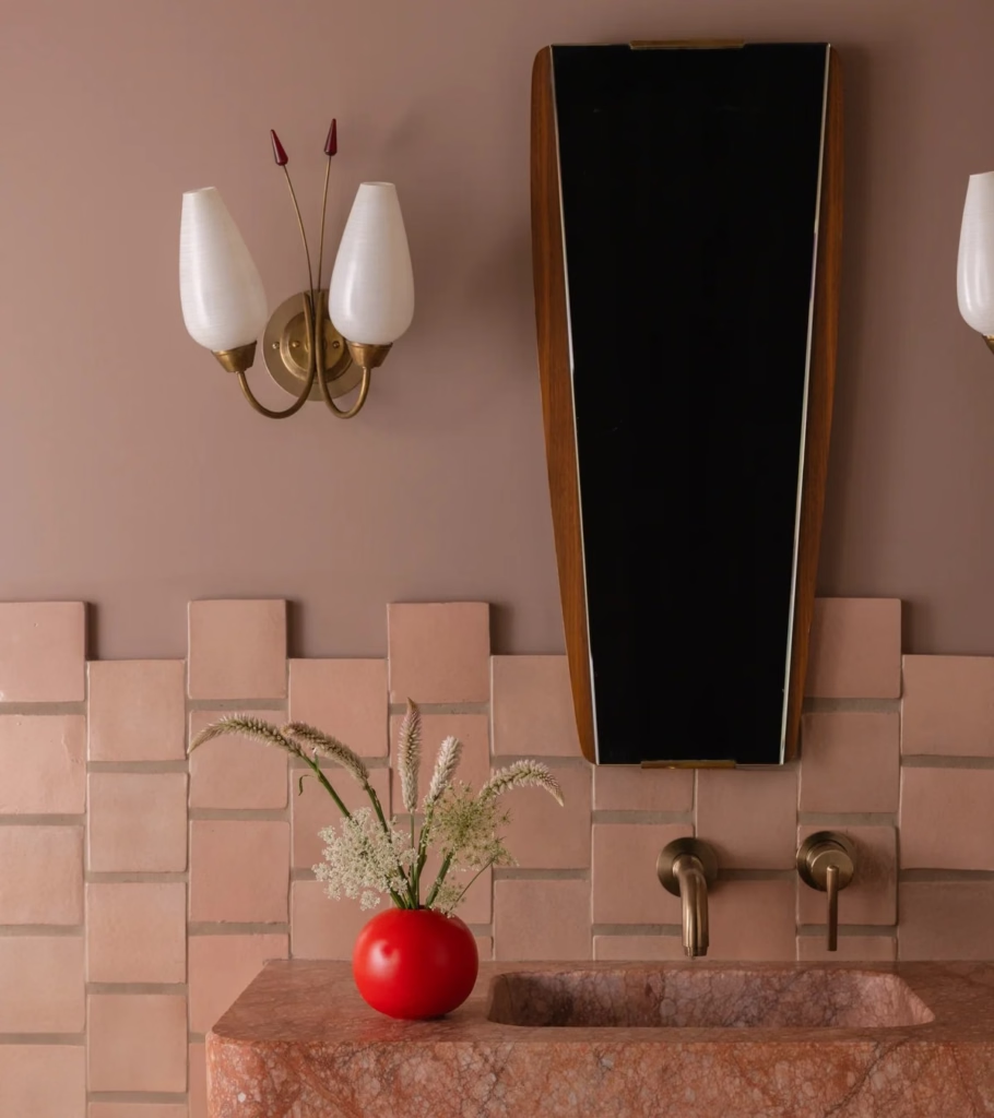
Rose Earth is a warm, earthy pink inspired by traditional mineral pigments from clay deposits in Italy. Graham & Brown describes it as soft, understated and versatile, with the depth and natural character associated with mineral-based earth tones.
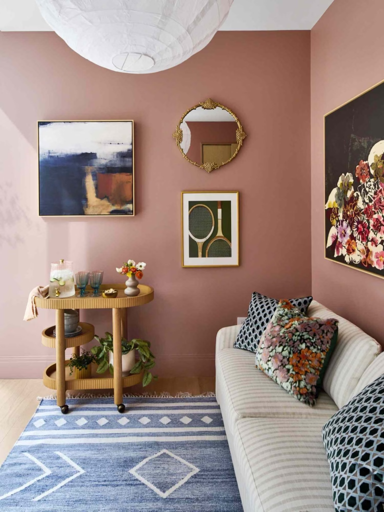
And this is where pink gets a very interesting promotion. Pink is becoming a neutral. Not in the traditional “white, beige and gray” sense, but in the sense that a muted, earthy pink can provide a foundation for an entire room. Rose Earth can work with warm neutrals, natural materials and deeper colors, or stand on its own.
Graham & Brown also chose Rose Earth specifically to complement its 2027 Design of the Year, Roselle Grove, a chintz-inspired floral pattern celebrating decorative history and craftsmanship. The combination is basically a love letter to heritage design—but with a modern sensibility. And I am here for the return of pattern, craft and personality.
After years of spaces that sometimes felt like they had been assembled from the same twelve objects, there is something wonderfully human about embracing a little history. A dusty rose wall, floral wallpaper, antique furniture, layered textiles and a killer piece of art? That’s a room with a story.
Rose Earth doesn’t demand attention. It simply makes everything around it look better.
Dutch Boy
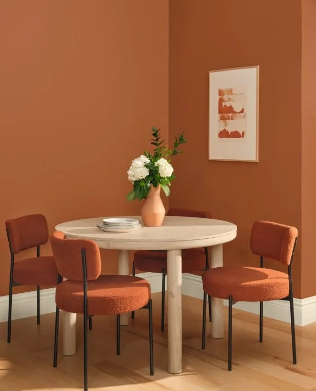
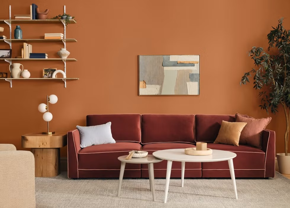
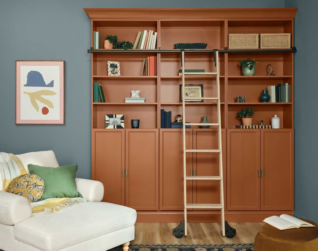
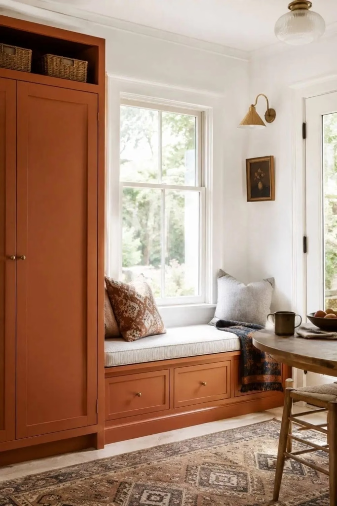
So Dutch Boy decided we needed a little more spice. Deep Rooted is a rich, earthy orange inspired by the warmth of nature. Dutch Boy describes it as a color that brings grounded optimism and comfort into the home while creating spaces that feel personal, inviting and alive.
Finally! A color with a little personality. But even Deep Rooted is not about being flashy for the sake of being flashy. Dutch Boy’s research and trend work point toward a cultural desire for intentional living, connection and homes that feel personal rather than overly styled. Its palettes pair Deep Rooted with everything from soft neutrals to blues and greens.
This is important because orange can sometimes scare people. I get it. You don’t necessarily want your living room to look like a pumpkin exploded in it.
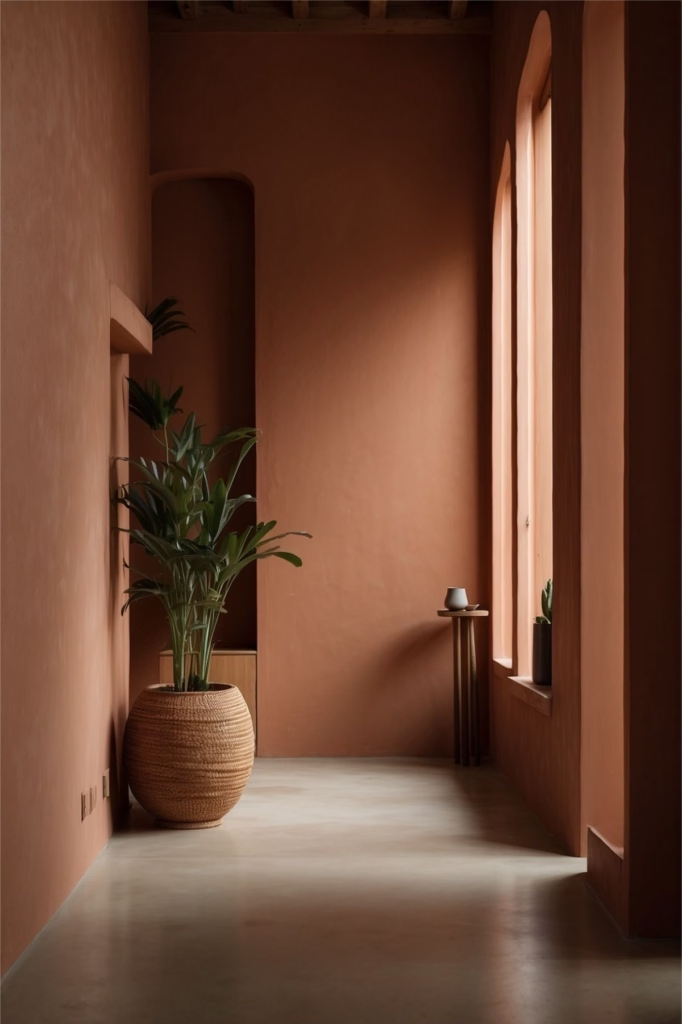
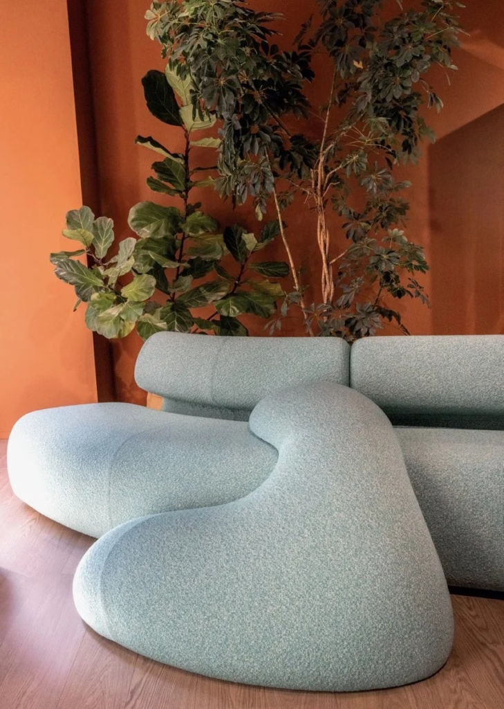
But an earthy orange is a completely different animal. Think terracotta, clay, burnt earth and autumn leaves rather than bright traffic-cone orange. Deep Rooted could be gorgeous in a dining room, library, powder room or as an accent in a space filled with natural materials. And paired with blue? Oh, absolutely.
Deep Rooted is the color in this group that reminds us that comfort doesn’t have to be quiet. Sometimes comfort has warmth, richness and a little drama.
So What Is 2027 Trying to Tell Us?
Looking at these five colors together, I see a pretty clear cultural shift. We want our homes to restore us.
Celery says reconnect with nature. Soulful Sage says lighten the emotional load. Grounded says create a sanctuary. Rose Earth says return to craftsmanship, heritage and warmth. Deep Rooted says find optimism and possibility in the familiar. Notice what isn’t happening here: none of these colors are telling us to create a perfect showroom. They are telling us to create a home. And that distinction matters.
I think we’re becoming much more comfortable with the idea that our homes should reflect our personalities, our histories and the way we actually live. We want spaces that feel layered, tactile, collected and authentic. We want natural materials. We want color. We want vintage pieces mixed with new ones. We want rooms that feel like somebody actually lives there. Basically, 2027 is telling beige to take a seat.
Stay tuned for Part 2 where we’ll explore four companies that let us know that Blue is clearly having a moment!
See ya next time.

0 Comments