
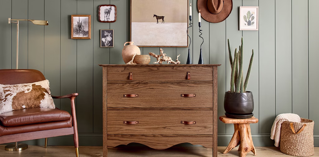
Every January, the big color authorities do what they do best: tell us what emotional state the planet is collectively experiencing…using paint. And listen, it’s never just a color. It’s never just “blue” or “beige” or “green.” It’s always “hopeful but grounded,” or “nostalgic with a side of resilience,” or “romantic introspection layered with renewed optimism and maybe a houseplant.”
Color of the Year choices aren’t random. These companies are watching economic patterns, global vibes, cultural burnout, political chaos, how much therapy we’re collectively doing, how much online shopping we’re not supposed to be doing—and they distill that into a hue we’re apparently supposed to redo our living rooms with. These shades then influence everything from sofas, accent chairs, tile, cabinet finishes, and rugs to nail polish, handbags, makeup packaging, clothing, branding, and product design. If color cycles tell a story, the 2026 story is this:
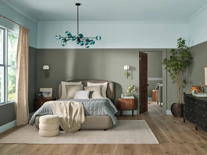
We are collectively exhausted, we want calm without boredom, emotion without chaos, luxury without screaming for attention, and we need home to feel like a stable hug. If 2026 had a mood board, it would be equal parts “take me to the forest,” “let’s sit in the dark and feel our feelings,” and “please, for the love of all things holy, give my brain a neutral reset.”
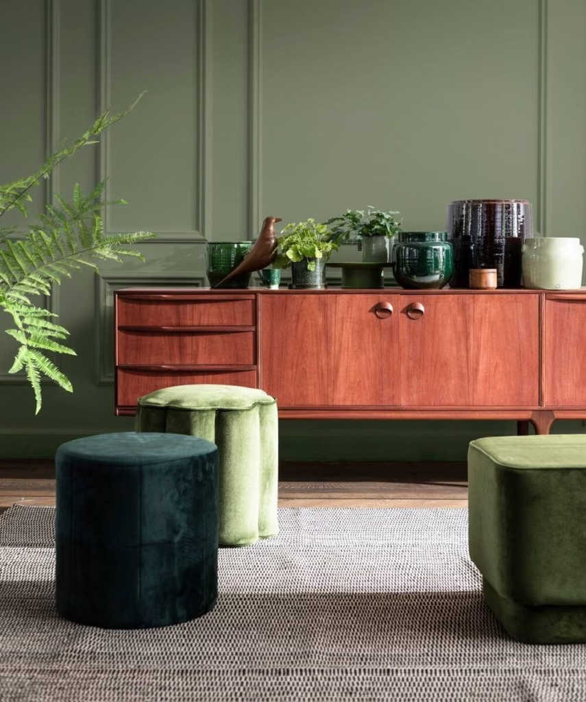
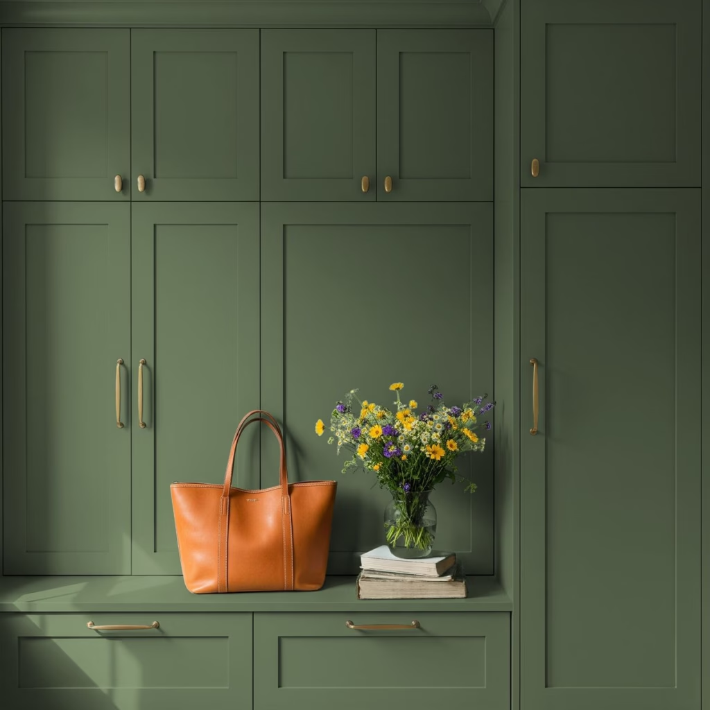
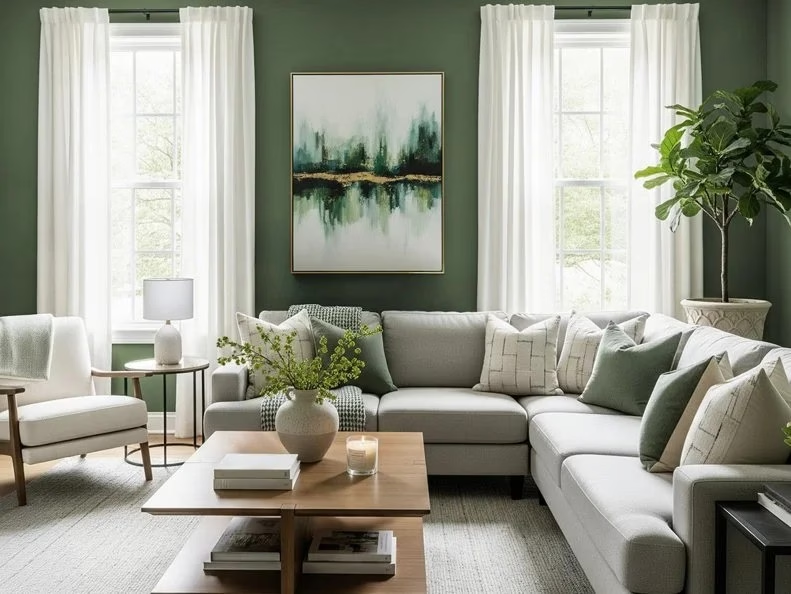
The greens are everywhere because we’re collectively craving grounding, nature, and proof that calm still exists.
The dark, moody tones are still having their cinematic moment—rich, emotional, cocoon-like shades that say, “Yes, I have depth and probably three scented candles burning right now.”
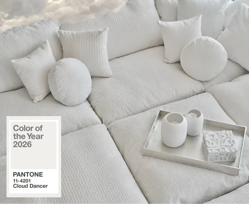
And then there are the neutrals, wrapping everything in warmth and softness, including Pantone’s very spicy decision to essentially choose…white. A whisper of color. A soft sigh. A “let’s not do too much this year” kind of selection. Controversial? Absolutely. But honestly, it fits the vibe. We want peace, we want depth, and we want comfort—and 2026 color trends are delivering all of it.
So let’s talk about the stars of 2026 and what they say about where we are emotionally and aesthetically and why ultimately “society picked it.”
Behr – Hidden Gem
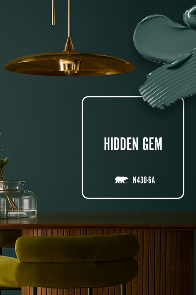
A moody blue-green with depth, but not drama queen energy. This is introspection in color form. It’s thoughtful, earthy, and wise—like nature therapy, but with better lighting.
The Vibe: Grounded luxury with emotional intelligence.
Why Society Picked It: We want that soothing connection to nature—minus the bug spray and camping gear.
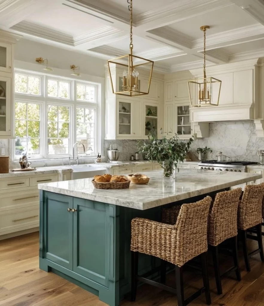
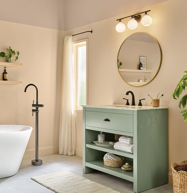
Valspar – Warm Eucalyptus
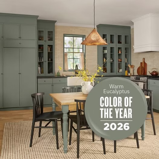
Softer than sage, warmer than gray, and incredibly livable. It’s like a breath of fresh air wrapped in a blanket.
The Vibe: Spa day meets Sunday afternoon silence.
Why Society Picked It: Nature indoors isn’t a trend anymore—it’s therapy.
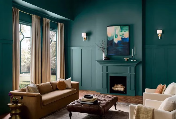
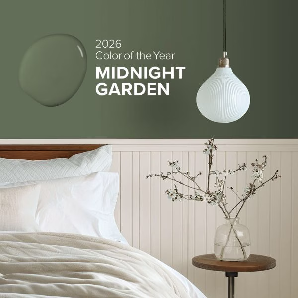
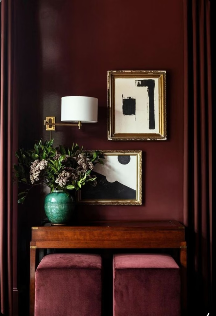
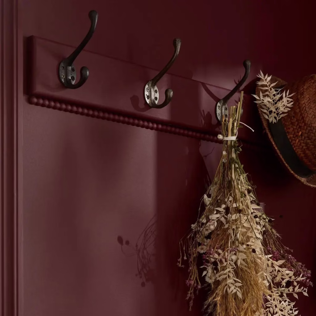
Dunn Edwards – Midnight Garden
This deep green says mystery, romance, emotional storytelling, and the beauty of dark, cozy spaces. It’s fantasy novel vibes without leaving your sofa.
The Vibe: Enveloping, mysterious, lush.
Why Society Picked It: We want escape, depth, and storytelling in our spaces.
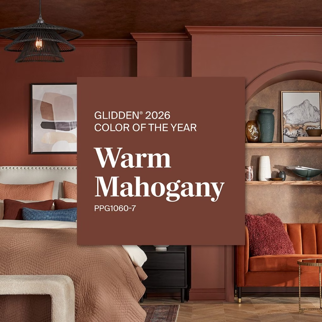
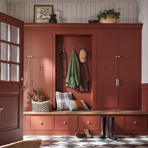
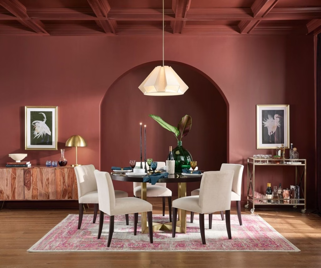
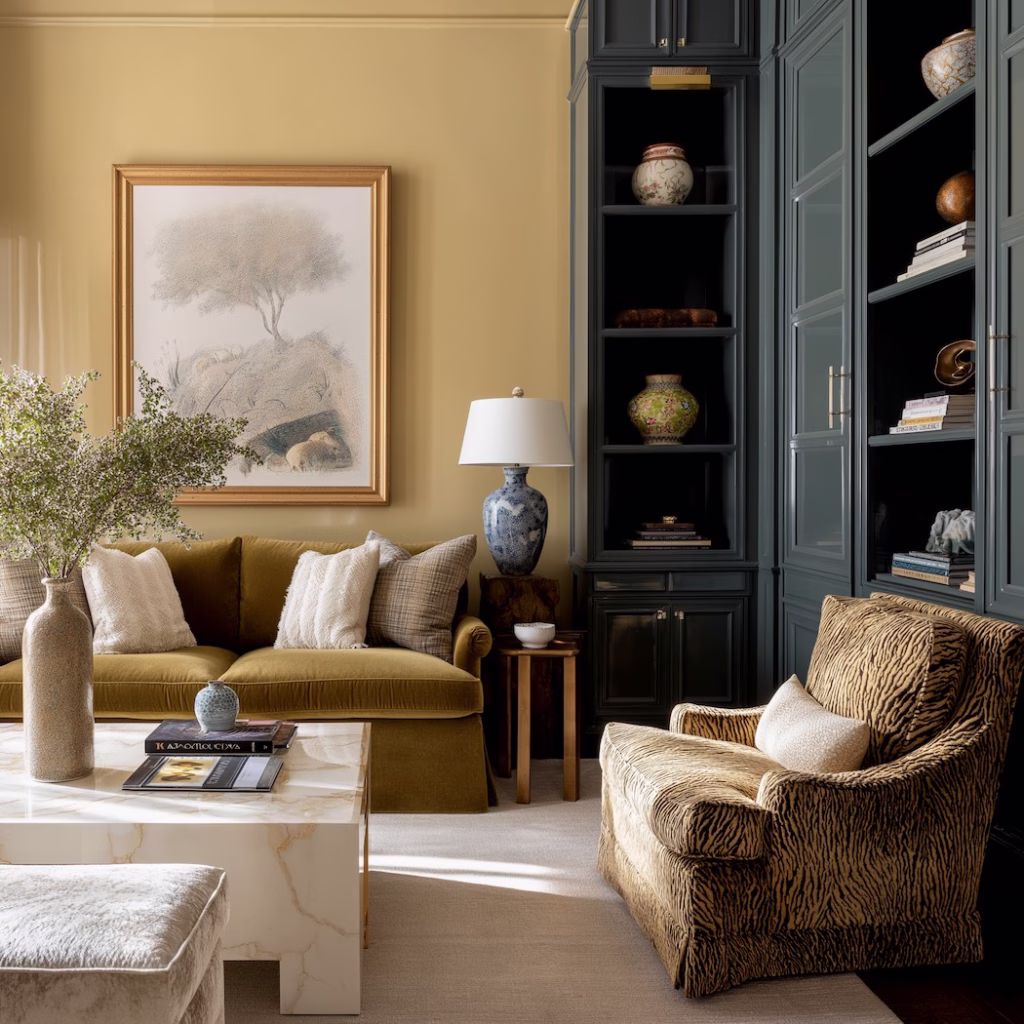
Glidden – Warm Mahogany
Rich, nostalgic, and a little romantic, this shade feels like leather chairs, cherished spaces, and heirlooms. It’s “I read books that don’t come from a streaming service recommendation” energy.
The Vibe: Warm, secure, deeply comfortable.
Why Society Picked It: We’re rediscovering craftsmanship, heritage, and depth.
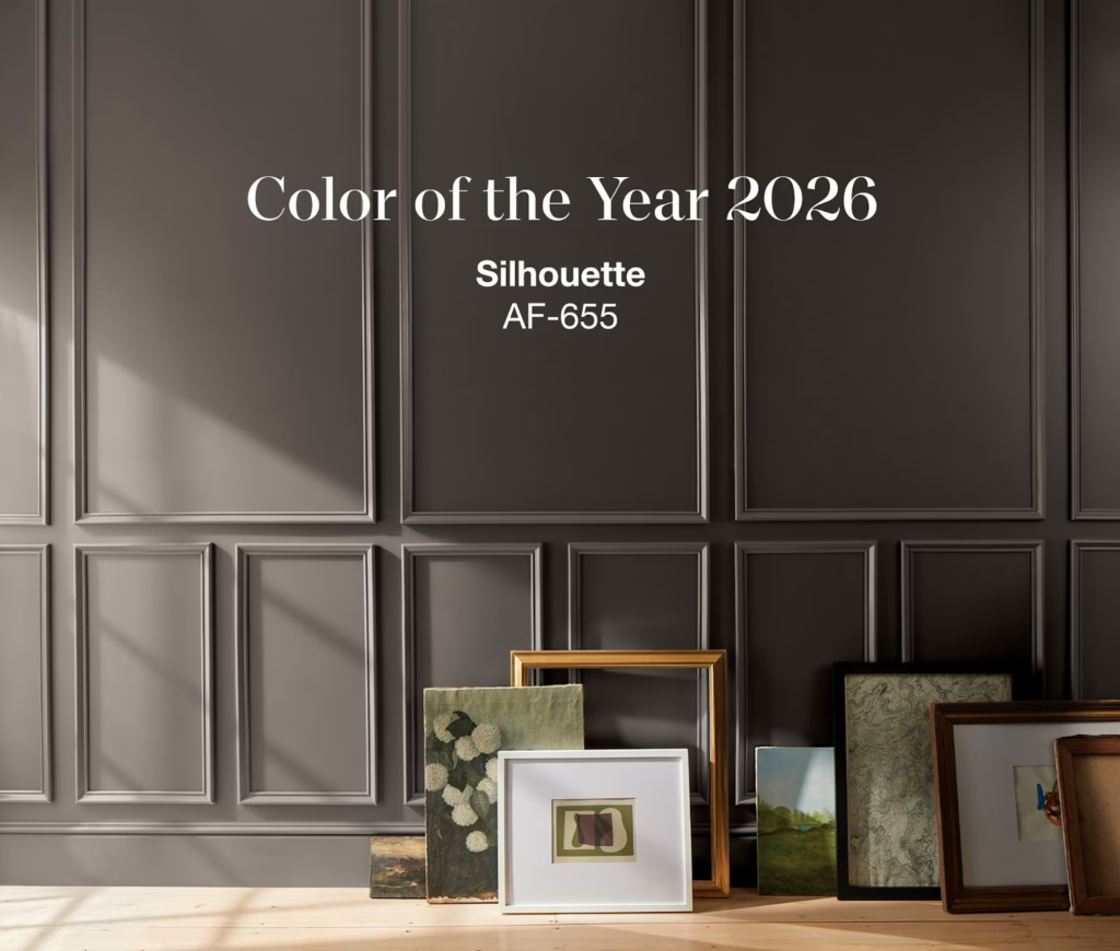
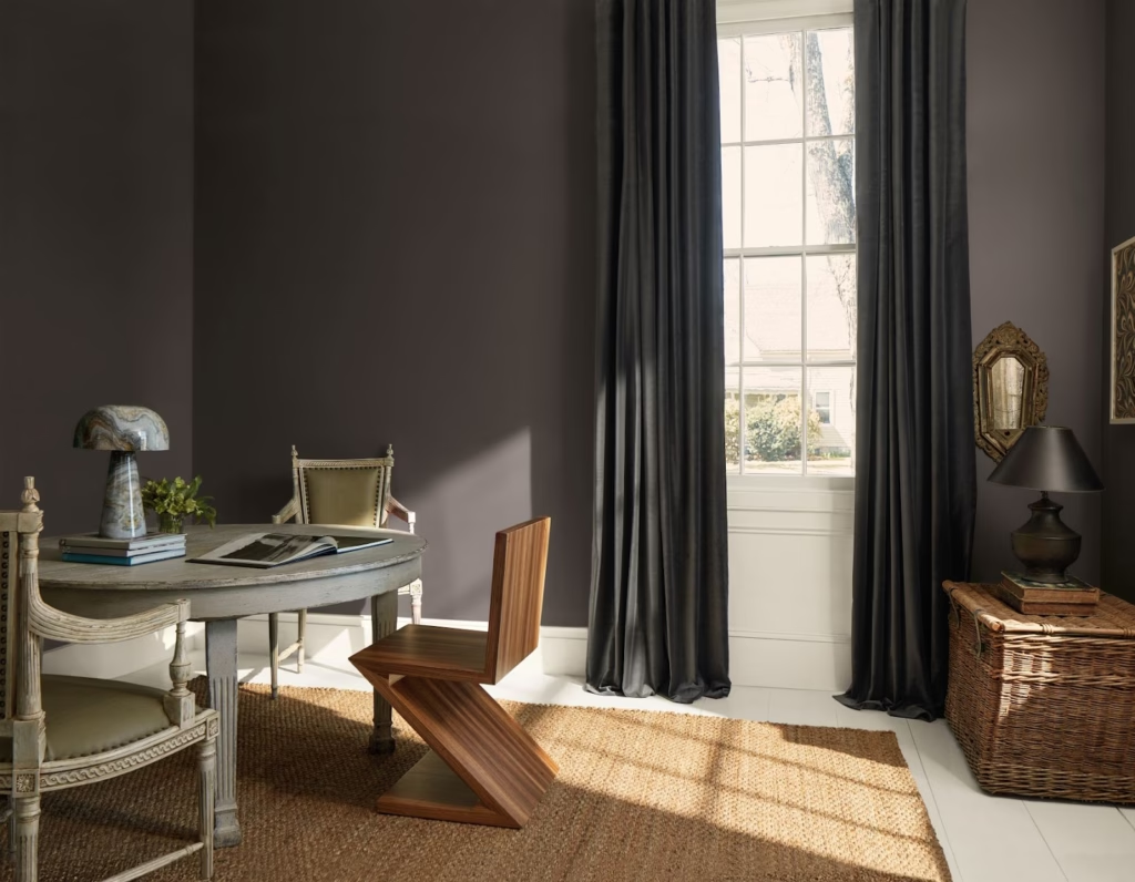
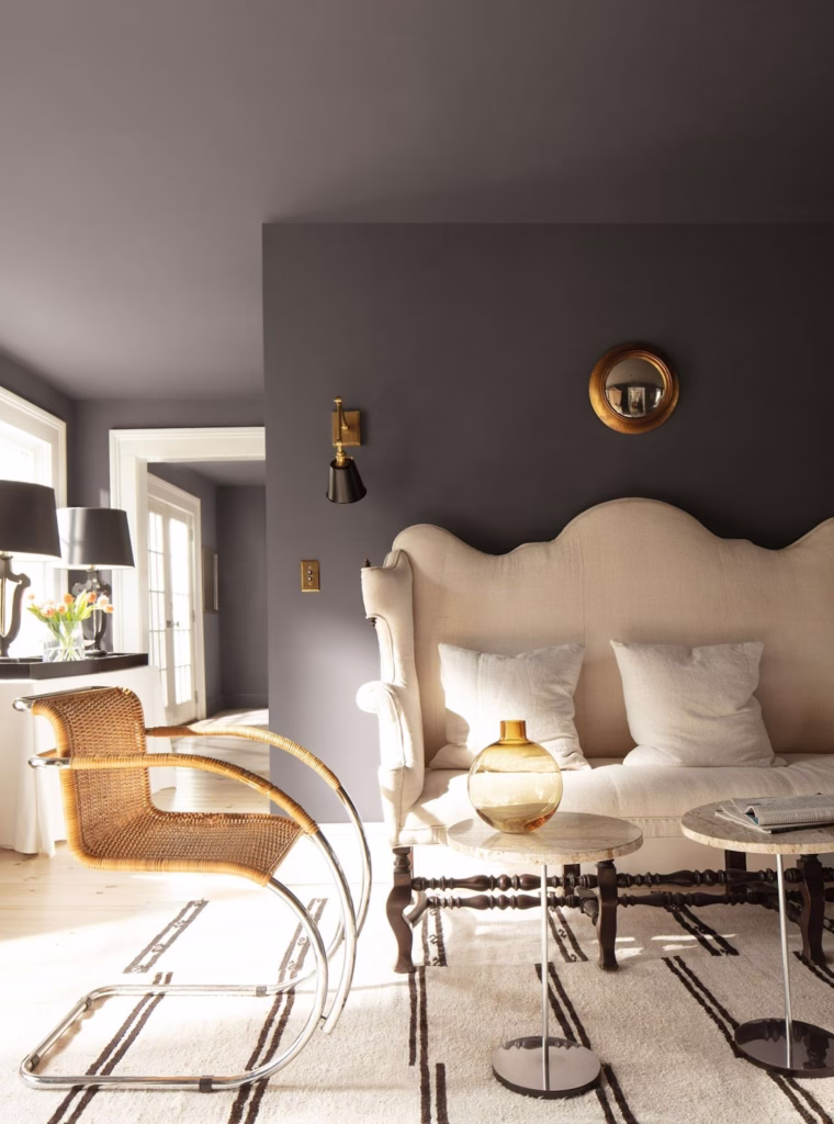
Benjamin Moore – Silhouette
Deep charcoal with plum soulfulness layered in. Dramatic, but not loud. Emotional, but mature. It says, “I feel deeply, but I also pay my bills on time.”
The Vibe: Quiet luxury with a poetic streak.
Why Society Picked It: Depth, complexity, and sophistication are in. Surface-level is out.
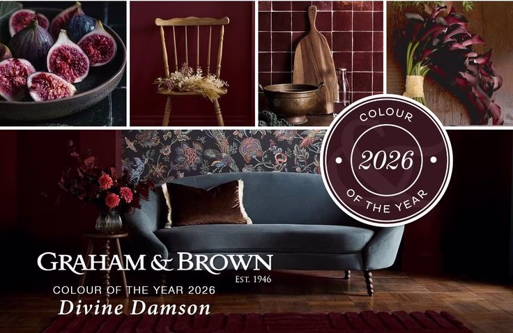
Graham & Brown – Divine Damson
Bold. Lush. Regal with personality. This is for people who are done apologizing for liking color and want their home to have presence.
The Vibe: Luxurious, expressive, drama-with-good-intentions.
Why Society Picked It: We’re stepping into personality again—purposefully.
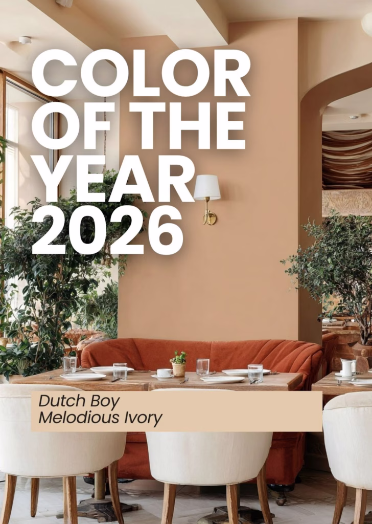
Dutch Boy – Melodious Ivory
A gorgeous warm ivory that feels like candlelight—even when there are no candles lit. Soft, creamy, supportive, and instantly comforting.
The Vibe: Calm confidence. Gentle warmth. Effortless elegance.
Why Society Picked It: Neutrals aren’t going anywhere, but now they need to feel like something.
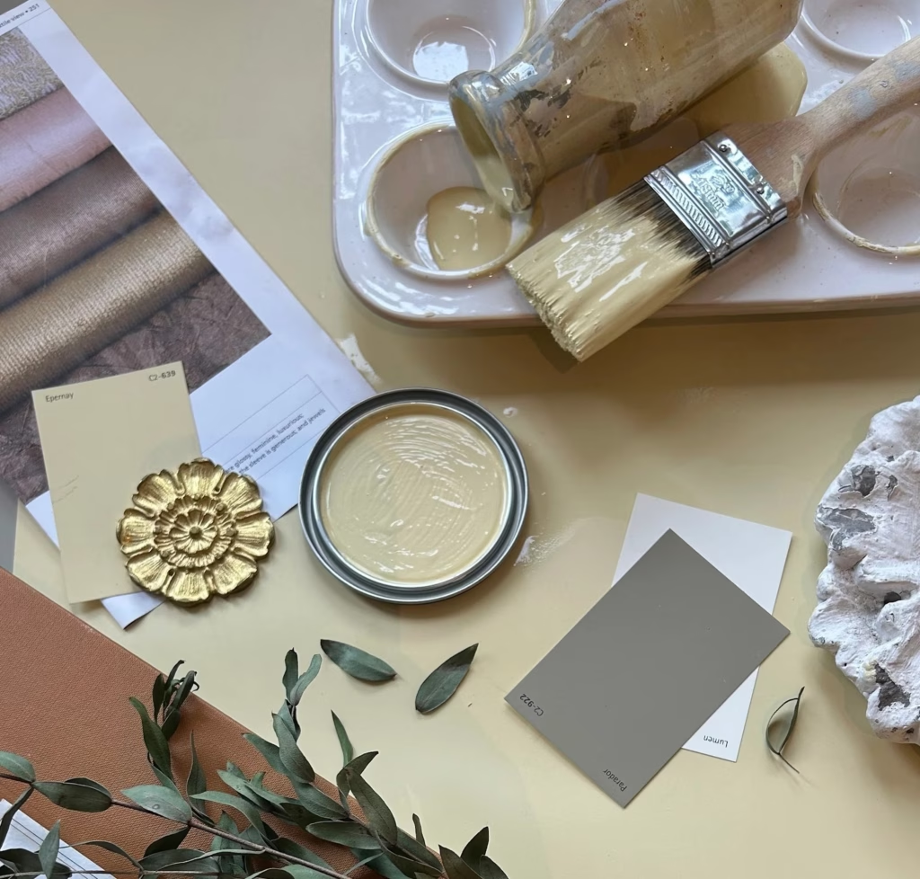
C2 – Epernay
Champagne warmth in paint form. Light golden undertones, European energy, timeless elegance. If a wall could toast to a better year, it would look like this.
The Vibe: Refined, celebratory, elevated without trying too hard.
Why Society Picked It: Understated luxury is still the goal. We like pretty—just softly pretty.
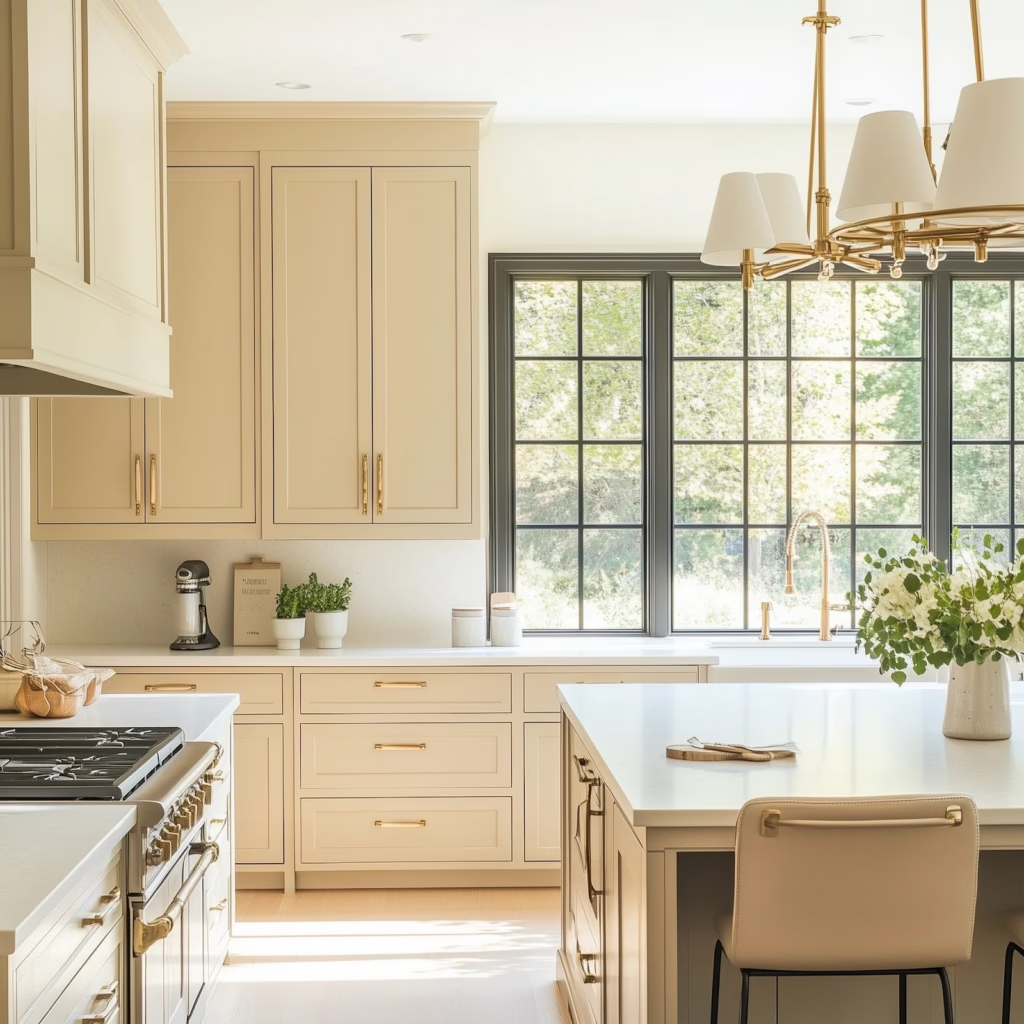
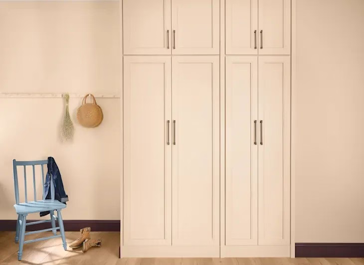
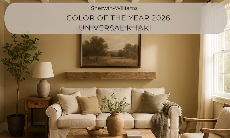
Sherwin Williams – Universal Khaki
This beige walked in and said, “I am neutral, I am dependable, I’m here to stabilize your life choices.” It’s warm, grounding, and deeply comfortable in that beautifully curated, real-estate-friendly way.
The Vibe: Homey, approachable, reassuring.
Why Society Picked It: People want calm and safe design. Stability is sexy again.
Pantone – Cloud Dancer
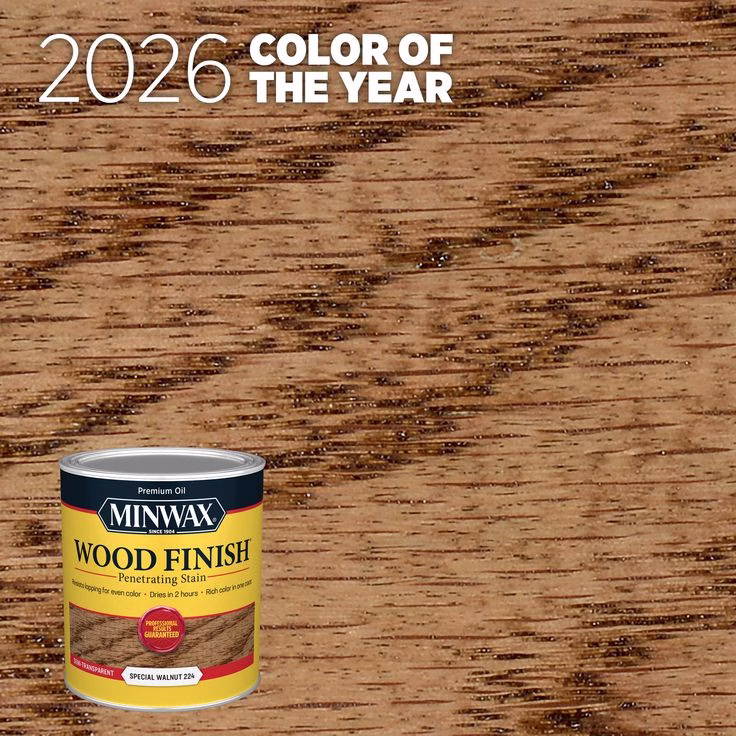
Minwax – Special Walnut Stain
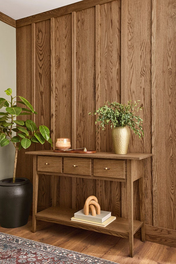
Minwax said, “Paint is cute, but wood still runs the world.” This warm wood tone is grounding, timeless, and feels deeply honest. It’s the stain of commitment.
The Vibe: Authentic, warm, rooted.
Why Society Picked It: Natural materials are back in a big way. People want real.
Krylon – Coffee Bean
Think espresso bar, moody café, cozy but elevated. Dark brown is officially glamorous now. This is the refined older sister of black—equally sophisticated but warmer and friendlier.
The Vibe: Rich, cozy, metropolitan café chic.
Why Society Picked It: Maker culture. Craft. Elevated everyday objects.
So…What Does All This Actually Mean?
For Interiors
Expect softer, warmer homes. Fewer loud “statement colors” and more depth, grounding warmth, emotional mood, and nature influence. Comfort is the new status symbol.
For Fashion
Think deep plums, forest greens, espresso browns, creamy ivories, and relaxed sophistication. Luxe fabrics + comforting palettes = wearable emotional support.
For Product & Design
Packaging is going richer, moodier, earthier, and more tactile. Brands want to feel trustworthy, human, and connected.
The Emotional Story of 2026 in Color
Collectively, 2026 color trends say:
We’re tired, wiser, calmer, and craving meaning.
We want beauty, but we want it grounded.
We want luxury, but not loud luxury.
We’re choosing intentional design, emotional well being, connection to nature, and spaces that whisper, not shout.
If these companies are right—and they usually are—2026 is about feeling safe, soothed, empowered, and beautifully cocooned…with just enough drama to keep life interesting. Ultimately, 2026 isn’t about one color — it’s about feeling at home in a world that’s uncomfortably fast and uncertain. These colors support introspection, groundedness, and emotional intelligence — or at least give us something pretty to stare at while we try to figure out life.
When you’re ready to use these colors in real homes, real life, or real projects, call me. I’ve got opinions… and paint decks.
See ya next time.

0 Comments